Revere Pewter or Agreeable Gray wins for most rooms because greige borrows from both warm and cool without committing to either, letting dark floors stay visible instead of looking dated.
Skip it if you want the room to have an actual point of view; the safety flattens into background noise after a few years, especially where natural light is scarce.
The real limit is your floor’s undertone.
Hold white paper against the boards at 4 p.m.; if the wood throws orange or yellow, you need the cooler side of these neutrals, and if it reads steely, the warm side saves the room from collapsing into shadow.
[link-whisper-related-posts]1. White
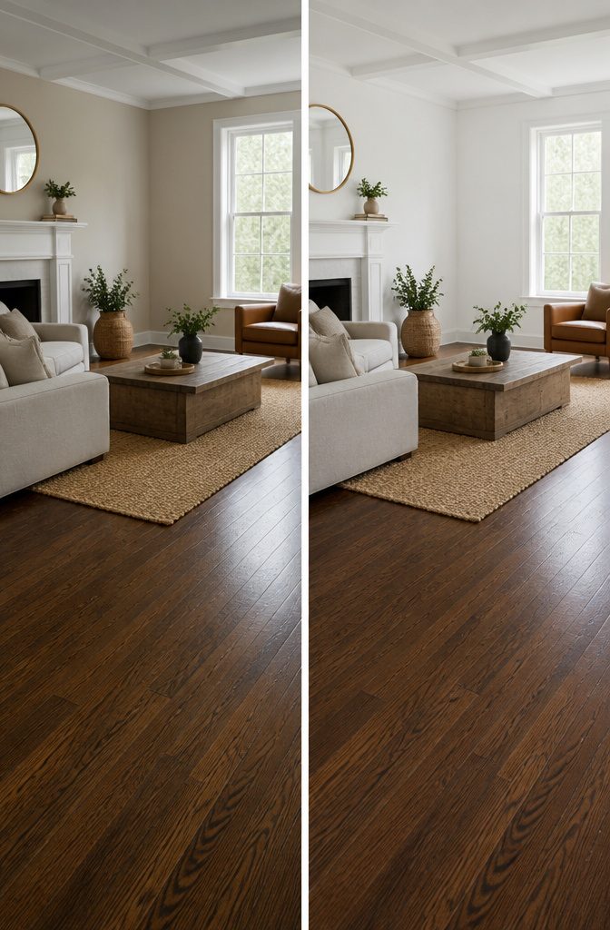
Crisp white walls against dark wood floors deliver the kind of contrast that makes both elements feel intentional rather than accidental.
Pure White (SW 7005) and Simply White (Benjamin Moore) sit at the cleaner end of the spectrum, and that cleanliness matters more than most people expect when they grab the first white off the shelf.
The undertone of your floor decides which one survives the weekend. Warm wood, the kind that reads reddish or honeyed under afternoon light, pairs better with Simply White.
Its subtle warmth keeps the wall from looking sterile against all that richness. Cooler floors, espresso or walnut with gray cast, need Pure White’s neutrality or the room starts feeling muddy.
Where white falls flat is in rooms that already lack natural light.
A north-facing bedroom with yellow-tinged off-whites, linen white and its relatives, turns dated fast and fights your furniture. Gray undertones beat pink or yellow every time.
The real limit is how much contrast you can live with. Stark white every wall in a small space can feel like a gallery, not a home.
If the floor is very dark, very dominant, white sometimes needs breaking up with texture, wood trim, or a single deeper accent wall to keep the room from reading as two competing slabs of color.
2. Light Gray
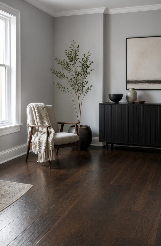
Light gray walls read differently than white in a room with dark floors, especially when the windows are scarce.
White can turn flat and reflective under artificial light, bouncing glare without adding depth. A soft gray absorbs just enough light to feel like a deliberate color choice rather than a default.
Sherwin-Williams Silverpointe (SW 7653) and Gray Screen (SW 7071) sit in that narrow band where the tone stays airy without tipping into cold.
Silverpointe carries a faint warmth that keeps it from looking institutional; Gray Screen leans slightly cooler, which pairs well with floors that have ash or slate undertones.
Both work in basements or north-facing rooms where you need the wall to do some of the visual lifting.
The practical difference shows up at dusk.
White walls against dark floors can feel like a spotlight on the contrast; these grays let the transition from wall to floor settle into something quieter. If your floors read warm, test Silverpointe first.
If they run cooler, Gray Screen is the safer bet. Either way, go lighter than you think and use a flat finish, which hides the imperfections that jump out under low light.
3. Dark Gray
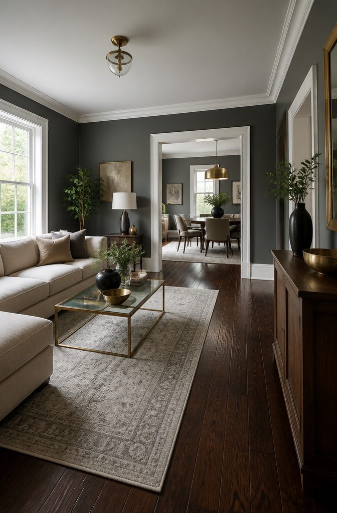
Chelsea Gray (SW 2850) sits in that narrow zone where a wall color can feel either rich or suffocating, depending on what the floor beneath it is doing.
The warm undertones keep it from going cold, which matters because dark wood floors already pull a room toward shadow.
Pair it with brown-toned boards and the effect is layered and intentional; pair it with floors that already run gray, and you risk a space that feels like a basement even on the sunniest afternoon.
The pairing works when you have enough else going on: white trim, brass fixtures, light that hits at least two walls directly.
Skip this entirely if your room has small windows, low ceilings, or a layout where the floor already swallows most of the light.
A dark floor plus dark wall is a commitment to mood, not a fix for a dim space.
I have seen it save a room with good bones and too much furniture, and I have seen it flatten a room that needed air more than it needed elegance. The difference is usually the square footage of glass.
4. Beige and Cream
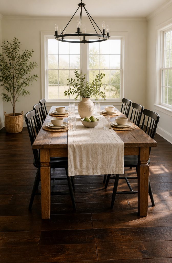
Warm neutrals read as intentional only when the undertone matches the floor. Alabaster (SW 7008) carries enough yellow to feel creamy rather than stark, but not so much that it turns custardy against cooler dark woods.
Check it against your boards at the hour you actually use the room: morning light pulls it whiter, while late-day sun brings out that subtle warmth that keeps beige from looking like a default rental choice.
Plain cream needs more care. Sources disagree on whether it belongs with cool-toned floors at all; one reading says stick to warm undertones only, while another groups cream and alabaster together as safer compromises.
My take: if your floor reads espresso or ash-cool, alabaster is the safer bet. Cream can shift too yellow and start fighting the wood rather than framing it.
Both colors need real light to work. North-facing rooms or spaces with heavy drapes will flatten cream into something muddy and apologetic.
A lamp with a warm bulb, 2700K or lower, helps after sunset, but if the room gets little natural light, these warm neutrals become harder to justify against a crisper alternative.
5. Light Blue
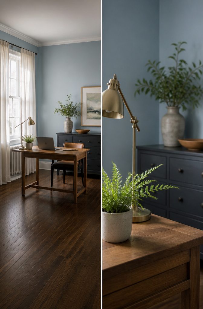
Bright blues fight dark wood floors for attention and usually lose, turning a room into a clash of saturated color against saturated grain.
The lighter end of the spectrum, something like Sherwin-Williams Mild Blue SW 6522 or Benjamin Moore’s Misty Blue, works because it steps back instead of shouting forward.
These hues carry enough gray to keep them from reading as nursery blue, and that same gray undertone is what lets them talk to the floor rather than argue with it.
The floor’s own undertone makes or breaks the pairing. A warm red-toned oak, the kind Hendricks Churchill used in their project, needs that cooler cast in the wall color to keep the whole room from tipping into too much warmth.
The blue-gray tempers the red; a warm white on a chair or trim finishes the balance. If your floor runs cooler, more ash or espresso than cherry, the same light blue can suddenly read too icy.
The undertone match matters more than the lightness level. Get it wrong and even the palest blue feels off; get it right and the dark floor becomes the grounding element the wall was missing.
6. Deep Blue
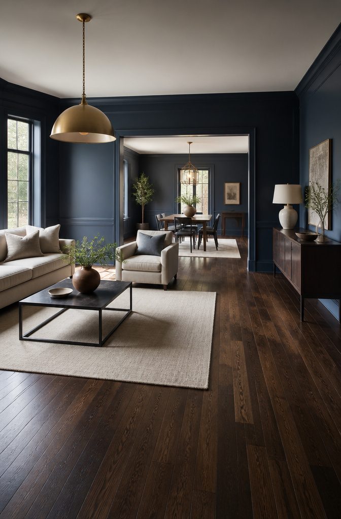
Hale Navy by Benjamin Moore carries enough depth to feel dramatic without tipping a room into gloom.
The pigment sits in that narrow space where a wall color reads as intentional rather than apologetic, and against dark wood floors it picks up the cooler undertones in walnut or espresso rather than fighting the warmth.
An accent wall is the safer entry point. Three walls in something like Swiss Coffee or a soft warm white keep the ceiling and corners bright, while the fourth wall in Hale Navy gives the eye a place to land.
Full-room use works if the room sees real daylight, but in a north-facing space or a rental with heavy trim, it can flatten.
One video walkthrough notes that shadows collect in corners with dark floors no matter the paint, and directional lighting aimed at the walls matters more when the color itself is absorbing light.
Furniture is what keeps this from feeling like a cave.
Light upholstery, cream or oatmeal rugs, and brass or glass surfaces break up the vertical weight. A glass coffee table or metal-legged pieces keep the floor from turning into a single dark plane.
If the sofa has to stay dark, light throws and pale cushions do enough of the same work. The contrast does not need to be stark; it needs to be present.
7. Green
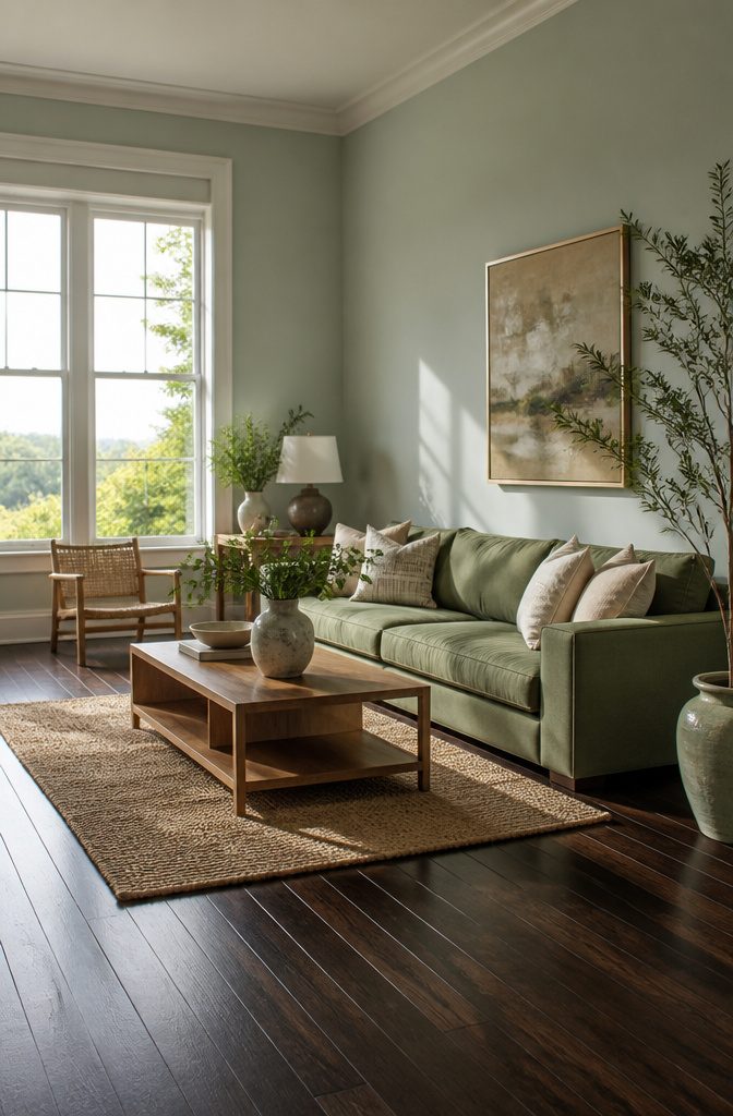
Green against dark wood is one of those pairings that either looks pulled from a forest cabin or like a hospital corridor from 1987, and the difference is almost always the undertone.
Sherwin Williams Sea Salt SW 6204 sits in that narrow band where gray, blue, and green share a wall; against espresso or walnut flooring, it reads fresh and slightly weathered, like something that belongs there rather than something pasted on top.
Its sister color, Rainwashed SW 6211, pushes a hair further into blue-green territory and tends to hold up better in rooms that get strong southern light, where Sea Salt can wash out to near-gray.
The undertone test that separates the keepers from the mistakes is simple but specific. Hold a paint chip against your floorboards in afternoon light, not morning.
Greens with even a trace of yellow, the ones that edge toward celery or sage, will pull amber out of dark wood and the whole room turns muddy before the first coat dries.
Sea Salt and Rainwashed survive this test because their gray base cools the green down; the wood stays rich, the wall stays crisp, and neither tries to out-warm the other.
Deeper greens like forest or hunter shades do work with dark floors, though they trade the airy feel for something more enclosed and evening-oriented.
For a weekend project on a few hundred dollars and a rental timeline, the lighter SW pairings leave fewer regrets and easier touch-ups when the lease ends.
8. Coral
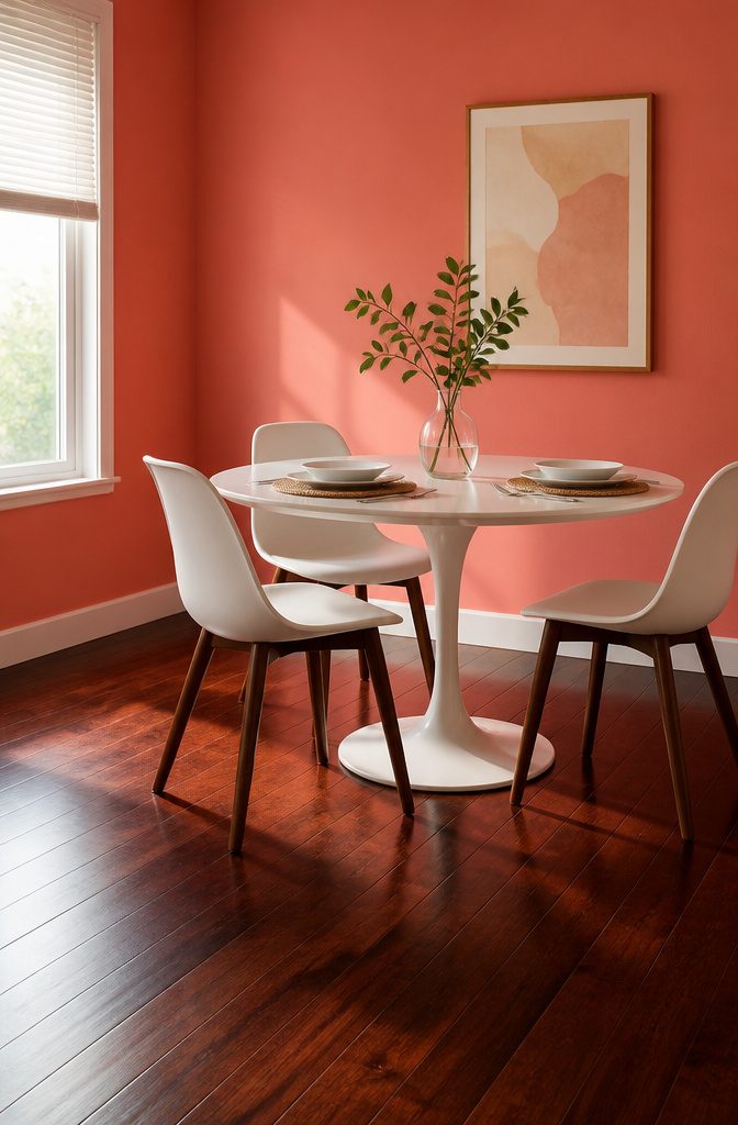
Coral Spice lands on a dark wood floor like a dare. At $81.99 a gallon, it is the riskiest choice on this list, and that is exactly why it works when it does.
The saturation plays against the floor’s depth instead of softening into it, something Ashley Macuga at Collected Interiors pushes hard: the floor becomes the canvas, the wall becomes the event.
The move fails in rooms where you already have visual competition. A kitchen with open shelving, a living room with a statement sofa, a bedroom with patterned textiles, these spaces will fight the color rather than feature it.
Where Coral Spice wins is in contained rooms with simple furniture profiles: a dining room with a plain wood table, a powder room with a pedestal sink, a home office with clean-lined storage.
The quieter the room’s other elements, the more the wall can carry.
Limit it to one wall, or to 25 percent of the total wall area if you are using it across multiple planes.
Any more and the floor starts to look like a hole you are trying to climb out of rather than a deliberate pairing.
The rest of the room should stay in the pale greige family, letting the coral do the work of carrying interest so nothing else has to compete.
9. Black
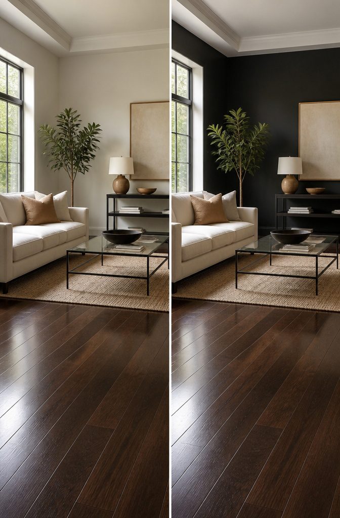
Black walls with dark wood floors only work when the room gets enough natural light to keep the space from feeling like a cave.
Limousine Leather by Behr runs about $54.98 a gallon, which is a steal compared to some premium blacks, but the paint cost won’t matter if you end up repainting within a month.
The mistake most people make is treating black as a bold accent rather than a deliberate envelope. Dark floors already swallow light; adding black walls in a dim room just removes any sense of boundary or air.
Susannah at Livingetc put it well: black pairs better with dark woods than with light ones, which can read cheap, but that pairing still needs something to bounce against.
Windows, high ceilings, or at least one wall of built-in white shelving become non-negotiable.
If the room faces north or relies on a single window, skip black entirely. The repaint timeline shortens dramatically when you realize you’re living inside a void.
Bedrooms and living rooms with afternoon sun fare best, since the warmth of dark wood offsets what coldness the black introduces. Even then, plan on keeping trim and ceilings crisp to carve out some visual breathing room.
10. Greige
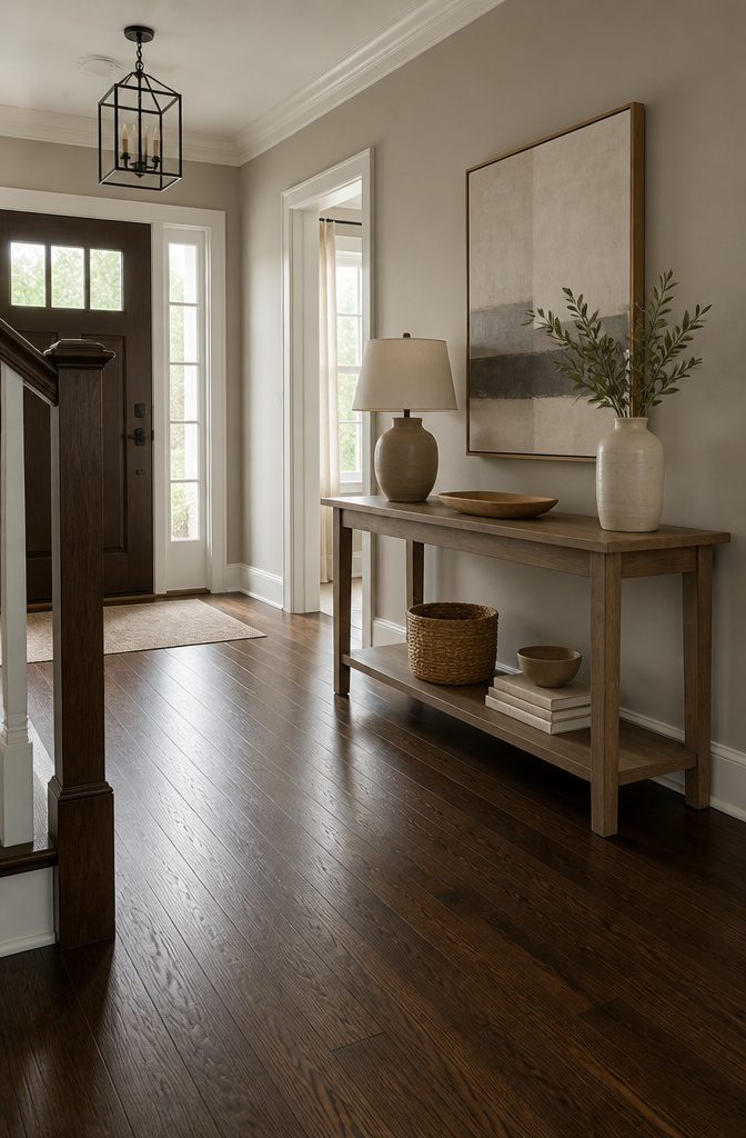
A wall painted Revere Pewter by Benjamin Moore or Agreeable Gray (SW 7021) sits right where warm beige and cool gray overlap, which is exactly why it has become the default choice for rooms with dark wood floors.
The combination reads as neutral without going cold, so the floor’s warmth stays visible instead of looking dated.
I have seen this pairing recommended so often that it now functions as a safe starting point for anyone unsure of their direction.
The safety becomes a problem when every room in the house ends up in the same muddy middle. Greige works because it borrows from both sides, but it also commits to neither.
After a few years of living with it, the color can flatten into background noise, especially in rooms with limited natural light where the gray side wins out and the beige disappears.
Charcoal, slate, and steel gray add classiness by coupling with wood’s natural warmth; greige does this more quietly, and quiet can tip into forgettable.
Two ways to play this: use it in high-traffic areas where you need the flexibility, or reserve it for spaces where you plan to add stronger color through furniture and art.
In a rental where the floors are already fixed and the walls must stay broadly appealing, greige buys time.
For a home you plan to stay in, it may borrow too much time and leave the room without a point of view.
11. Burgundy
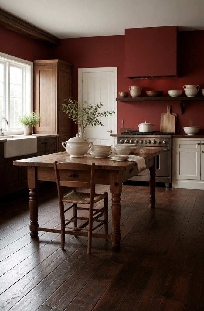
Burgundy fell out of favor sometime in the late 1990s, when every kitchen flipped to sage green and every living room to beige.
Cranberry Cocktail (2083-20) has quietly returned because people noticed that fighting a dark wood floor’s red undertone takes more work than joining it. At $55.99 per gallon, this Benjamin Moore shade leans into the warmth instead of neutralizing it.
The color works best in kitchens, where cabinets or an island painted this deep red can almost merge with the floor beneath it.
That kind of continuity needs breaking, though. Cream wall units, pale marble counters, or a beige rug keep the room from sinking under its own weight.
White reads too stark against this particular red; something warmer, like a pale blue or blush, softens the edge without washing out.
Natural light is the real limit here. A north-facing room turns Cranberry Cocktail flat and heavy.
I would not try it in a space that does not get direct sun for at least part of the day. In the right room, burgundy gives a warmth that gray or green simply cannot replicate.
12. Yellow
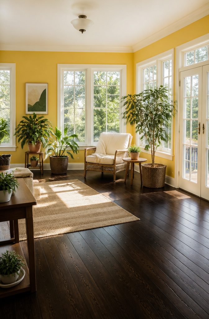
Yellow on dark wood floors walks a tightrope between morning light and daycare. I learned that the hard way in a rental with floors so brown they swallowed two cheerful samples whole before I found the line.
The saturation cutoff sits right around mustard. Anything brighter than Behr Yellow Flash at $40.98 a gallon starts reading juvenile fast, especially in rooms that already get decent sun.
Lighter yellows work better on a single piece of furniture or a window nook than on full walls; the experts who reach for ochre or mustard are solving exactly this problem, using richer tones that hold their own against dark flooring instead of competing with it.
Floor undertones matter more with yellow than with neutral paint. Brown or gray undertones in the wood give yellow something to push against, a tension that reads intentional.
Red undertones, though, turn the pairing muddy; the same yellow that sings against gray-brown floors sinks to flat against cherry-stained oak. If your floor leans warm-red, yellow is probably not the weekend project here.
Reading Your Floor’s Undertones
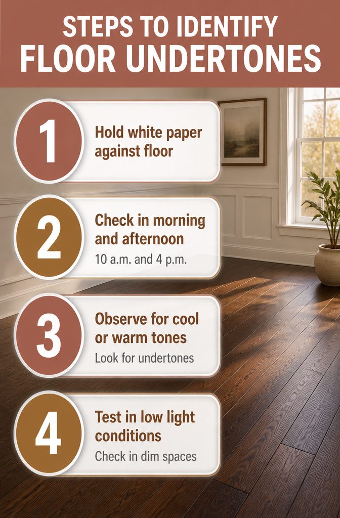
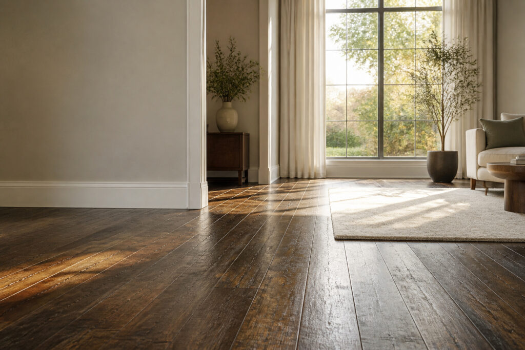
Dark wood floors look almost black in the hardware store sample, but the same plank can read completely different once it lives with your walls and your light.
The undertone is what decides whether a wall color will harmonize or fight, and most people spot it wrong because they check at the wrong hour.
The paper test still works.
Hold a sheet of plain white printer paper against the floor in daylight. If the wood suddenly looks orange or yellow against that white, you have warm undertones.
If it throws gray or steely, the floor runs cool. When the paper tells you nothing, the floor is neutral, which is rarer than the flooring labels claim.
Natural light changes the reading, so I run the same check at 10 a.m. and again at 4 p.m. Morning sun tends to flatten everything toward yellow; late afternoon drags out reds and ambers.
A floor that looked neutral at breakfast might show its warmth by dinner. The sample I almost painted over read as cool gray at the store, then turned distinctly warm once the north-facing window got hold of it.
The single condition where matching undertone beats contrast is when the room itself is starved for light.
A cool gray wall against cool dark floors in a basement or interior room keeps the space from collapsing visually. In rooms with decent windows, contrast usually wins, and you can let the floor’s warmth play against a cooler wall.
But in that one case, fighting the undertone turns the walls muddy and the floor flat. Pair like with like, keep it simple, and the room holds together.
Testing Paint Before the Weekend Commits You
Dark wood floors drink light differently than you’d guess from the paint chip under store fluorescents.
The same warm white that reads clean in a sample book can turn muddy against espresso-stained oak at 7 p.m., which is why the testing matters more than the choosing.
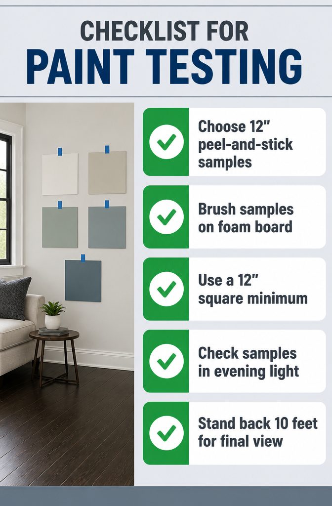
Two methods work for samples. Peel-and-stick squares, like the 12" x 12" ones from Samplize, stick flat and move from wall to wall without the mess of brushing out liquid paint.
The backing paper keeps them portable. Brush samples on foam board take more time and cost more by the time you buy the brush and the board, but they show actual paint thickness and sheen.
For dark floors especially, sheen changes everything; a satin sample on paper won’t read the same as satin on a wall.
A 12" square is the smallest patch that lets your eye separate the color from whatever was there before.
Smaller swatches let the old wall fight the new color for attention. Tape up or paint two coats on at least that much space, then wait.
Morning light flatters.
Afternoon light flattens. The truth comes at dusk, when the windows go gray and your lamps take over.
That’s the hour dark floors pull walls toward them, and a color that held its own at noon collapses into the floorboards. Check your samples then, standing back ten feet, before Saturday morning commits you to five gallons.
Accent Walls With Dark Floors
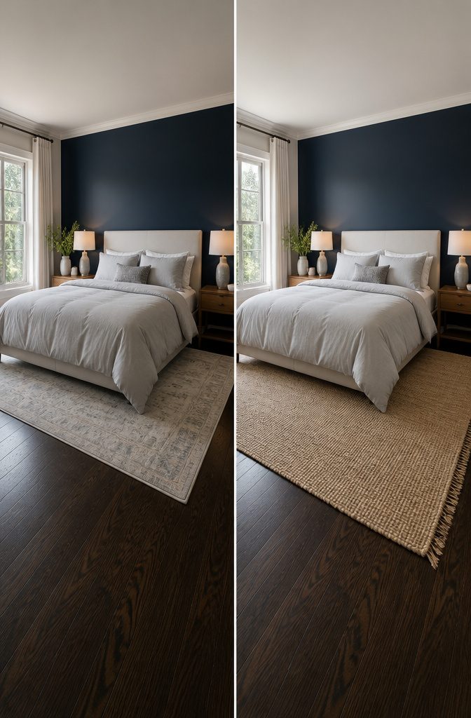
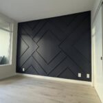
A single dark wall can work with dark floors, but the wall opposite your main light source is the one to avoid.
Painting the window wall deep navy or charcoal turns that surface into a light-absorbing void; the drama collapses into gloom.
The 60-30-10 rule keeps this in check: roughly sixty percent of the room stays light, thirty carries your medium tone, and ten lives in the accent itself.
That means the dark wall is one among several, not the room’s whole story.
Placement follows the furniture. The wall behind a bed or sofa reads as a backdrop, so the darkness recedes behind what you actually look at.
A dining room works differently. White wainscoting or a chair rail splits the wall visually, with the darker color riding the upper two-thirds; the white base keeps the floor from swallowing the space whole.
In a bedroom, the darker tone can sit behind the headboard where it does not compete with the floor for attention.
Blues, grays, and navy are the colors that tend to read as retreat rather than compression in that context.
The sleep studies get cited often enough to seem overblown, but the practical point holds: these tones settle a room when they are confined to a single plane.
Keep the ceiling and remaining walls in the light sixty percent, and the dark floor becomes grounding rather than closing.
What Trends Leave Out
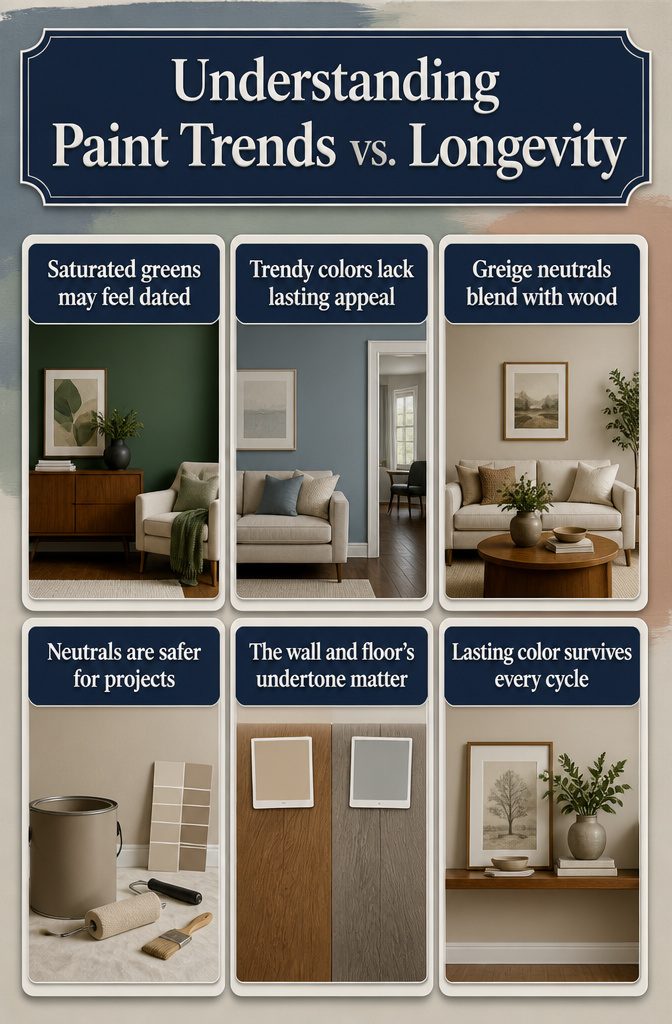
Gray and blue palettes have dominated the last few years of design magazines, and earthy neutrals, deep greens, and jewel tones are riding the same wave.
These cycles move fast. What actually lasts is the relationship between the wall color and the floor’s undertone, not the color’s current popularity.
I learned this the expensive way in our previous apartment. The source passages note that saturated greens can look very dated, but what got me was a trendy blue-gray that felt fresh for exactly one season.
By month six the room looked like a showroom display that had already been cleared for the next shipment.
Eighteen months in, I painted it out. The color had no conversation with the warm walnut floors; it sat on top of them like a filter.
Greige and warm textured neutrals create that earthy moodiness without the commitment to boldness.
That blend is harder to date because it borrows from the floor itself rather than announcing a year. When a color reads as "cozy with" rather than "trendy against" the wood, it survives the cycle.
The bolder nature-inspired palettes, coral and clay included, may share the limelight now, but neutrals remain the safer bet for a weekend project that needs to last until the next lease renewal or the first mortgage refinance.
Frequently Asked Questions
What wall colors go with dark wood flooring?
White, light gray, beige, and light blue are the safest choices because they create enough contrast to keep the room from feeling closed in.
Darker colors like navy, charcoal, and burgundy work too, but only in rooms with good natural light and lighter trim or furniture to break things up.
How do I choose a paint color to complement my dark wood floors?
Check your floor’s undertone first. Hold white paper against the boards in afternoon light; if the wood looks orange or yellow, you have warm undertones and should pair with warmer whites or greiges.
If it reads steely or gray, go cooler with pure whites or blue-grays. Match undertones when the room is dark, contrast them when you have decent windows.
What are the current trends for wall colors with dark wood floors?
Grays and blues have dominated recent years, with earthy neutrals and jewel tones like deep green and burgundy gaining ground now.
What Sherwin Williams paint colors complement dark wood floors?
Pure White SW 7005 works with cool-toned floors, while Silverpointe SW 7653 and Gray Screen SW 7071 handle low-light rooms without turning flat.
Sea Salt SW 6204 and Rainwashed SW 6211 are the green pairings that survive the undertone test against espresso or walnut. Agreeable Gray SW 7021 is the default safe choice if you are unsure.
What color complements dark wood?
Almost any tone can work, but nature-inspired colors like green and blue tend to feel most natural because they echo the wood’s organic origin.
Pastels also pair well since the floor’s depth keeps them from feeling too sweet. The real test is undertone: warm floors need cooler walls, cool floors need warmer ones, unless the room itself is starved for light.
What color walls complement dark brown flooring?
Crisp whites, soft grays, and warm greiges are the most reliable pairings. Dark brown floors read as strongly neutral, so the main pitfall is choosing a wall color with the wrong undertone rather than choosing the wrong lightness level.
Test samples at dusk, when dark floors pull walls toward them and colors that held up at noon can collapse into the boards.