The right paint colors that go with wood floors take two afternoons and a few sample swatches to find, and most people burn both on the wrong starting point.
The common mistake is matching warm with warm, thinking beige will blend with natural wood, but taupe and yellow undertones pull out the dingy side of maple or oak instead.
The pairing that actually works is cooler: whites with gray bases, soft pastels, and muted tones that let the floor own the warmth while the walls hold the air.
[link-whisper-related-posts]1. Light Wood Floors
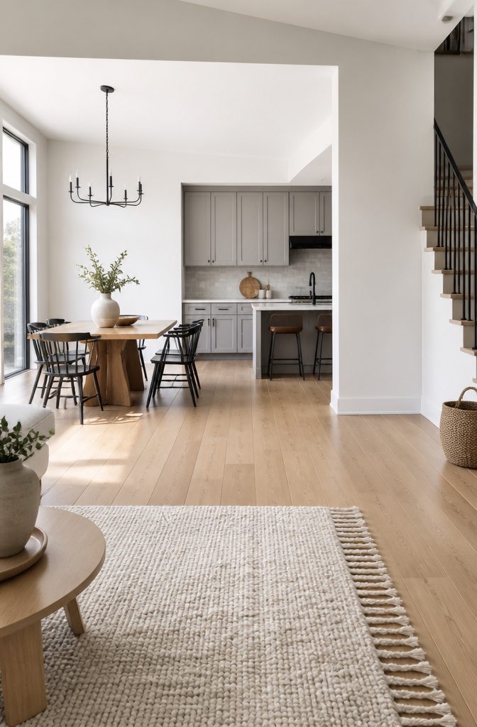
Light wood floors give you more room to work with than most people realize.
The common mistake is reaching for warm neutrals with yellow or brown undertones, thinking they will blend in, but taupe and beige actually pull out the yellow in natural wood and make the whole room feel dingy.
Cooler whites, soft grays, and light pastels are the pairing that works.
Pure White SW 7005 and Ice Cube SW 6252 both read clean and airy against light flooring without competing for attention. Ice Cube has just enough gray in it to keep the contrast interesting if your floors run honey or golden.
For something quieter than white, Sea Salt SW 6204 sits in that useful space between neutral and color. Its green-gray shift plays well against maple or birch, which tend to run cool themselves.
The undertone match matters more than the darkness of the floor. A warm light oak needs that cool wall balance more than a cooler white pine does.
I have watched rooms with red oak flooring go flat when the wall color carried the same warmth upward.
The floor already owns the warmth. The wall’s job is to let it.
2. Medium Wood Floors
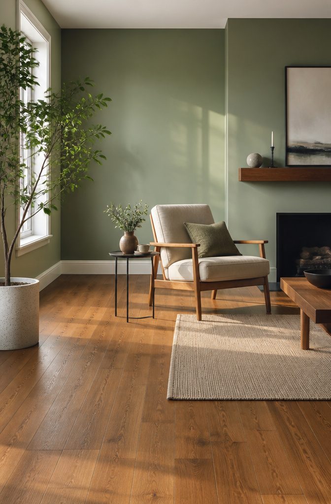
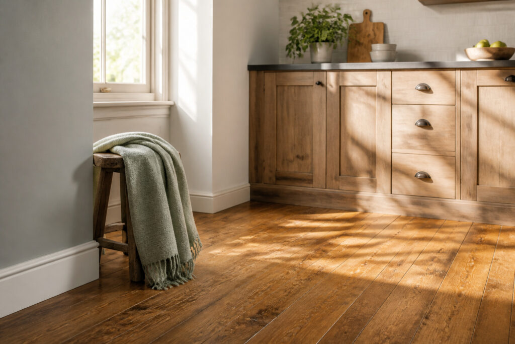
Medium wood floors sit in that sweet spot where most wall colors actually work, which makes them the easiest tone to get right.
Dusty greens read as a natural companion to this balanced brown; the muted quality keeps the room calm without turning it into a forest theme.
Cool blues push the same serene direction but lean more modern, and they handle rooms with less sunlight well since the color itself carries airiness.
Neutral whites are the safest default here, letting the floor do the visual heavy lifting while the walls recede.
Skip anything with warm beige or terracotta undertones, though. Those tones compete rather than complement, and the clash flattens both the wall and the floor.
If the medium wood runs warm, reach for cooler wall shades to keep the contrast clean; the reverse pairing works too, but warm-on-warm is where rooms go muddy fast.
Behr’s Stargazer is one specific that handles this balance for cooler-leaning spaces. In smaller rooms without much natural light, the wall color should stay lighter than the floor so the walls don’t close the space in.
3. Dark Wood Floors
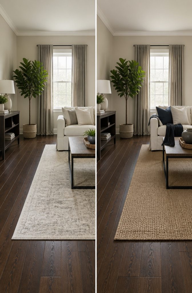
Dark wood floors pull a room toward the ground, and the walls have to push back if you do not want to live in a cave.
Go at least three shades lighter on the walls than the floor. That is the threshold where contrast starts to work, not just in theory but in the way the ceiling height reads when you walk in.
Agreeable Gray SW 7029 has enough warmth to keep a dark floor from looking theatrical, and Alabaster SW 7008 sits even lighter without going stark.
Both give the floor something to push against. Soft grays and cool tones, a hint of slate or sky blue, do the same job: they keep the room from going heavy.
I have seen bedrooms where the lightest sage green still felt grounded because the floor was doing all the anchoring, and the wall was just there to keep it from tipping into gloom.
White ceilings matter more here than anywhere else.
With dark floors, the ceiling is your sixth surface and often your only real source of bounce. Keep it white.
If you want one dark wall, make it an accent and stop there. The other three walls earn the room back.
4. Red Toned Floors
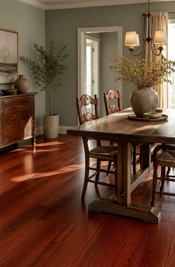
Red tones in wood floors, the kind that read cherry or near it, tend to push orange or pink when the afternoon light hits them. The wrong wall color turns that warmth into something that feels dated fast.
Cool whites, grays, and muted tones are the steadying hand here. Sherwin-Williams Sea Salt, a soft gray-green, sits far enough from the red to create quiet contrast without clashing.
Nonchalant White, another cooler option, does the same work without going sterile; it brightens the room while letting the floor’s warmth stay in its lane rather than dominating it.
Gray works on the same principle. A stony neutral like Colonnade Gray pulls the eye up and away from the floor’s intensity, giving the grain some breathing room.
The mistake most people make is reaching for a warm white or beige that picks up the same undertones; suddenly the walls and floor are competing to see which can look more pink.
For red floors, the cooler choice almost always wins.
5. Gray Wood Floors
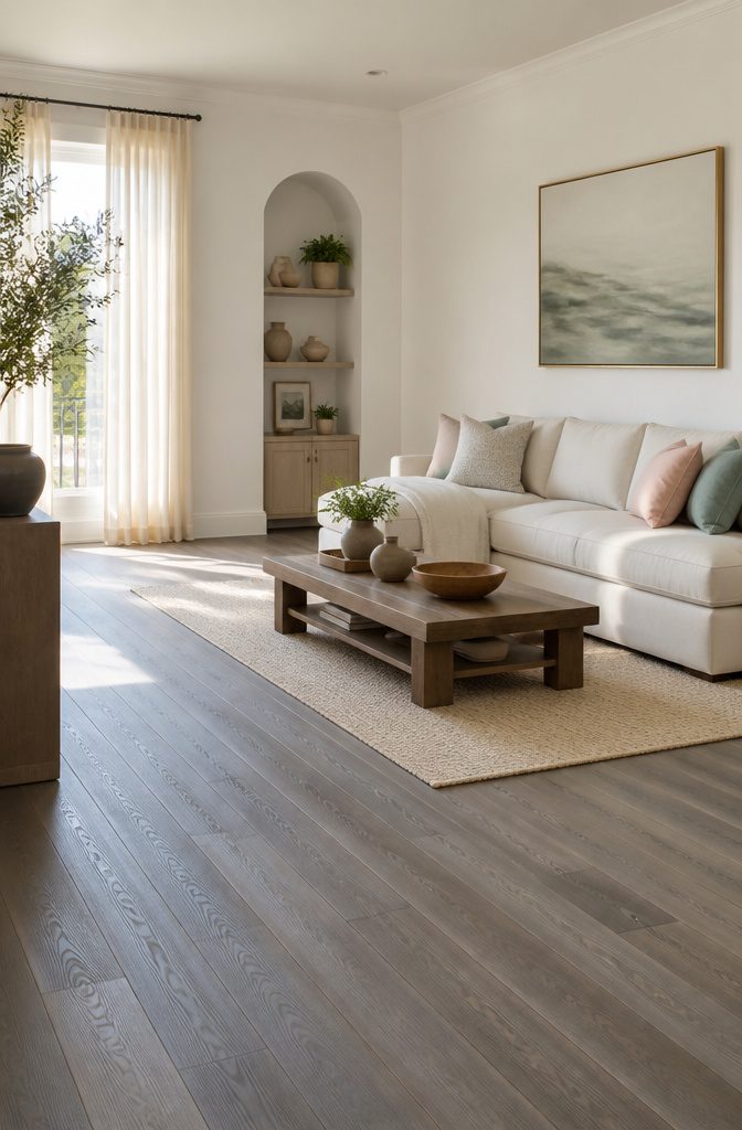
Gray wood floors read modern, but the undertone runs cold enough to pull the warmth out of a room if the walls lean the same direction.
The counterintuitive move is to go warmer on the walls than instinct suggests. A soft off-white with a warm base keeps the floor from feeling like a showroom slab while still letting it look intentional.
Benjamin Moore Chantilly Lace works here because it is clean without being icy.
It gives the walls presence without competing, and that little bit of warmth against the gray keeps the space from flattening into something that feels rented rather than lived-in.
Pale blue or green undertones can also complement light gray floors, though they need to stay muted to avoid turning the room into a color study.
The mistake to avoid is chasing the gray with more gray. Cool greige tones on the wall will deaden the floor rather than frame it.
Warm neutrals and soft pastels extend how long the gray flooring feels current, and they cost the same per gallon as the trendy choice that dates itself in two years.
6. Golden Oak Floors
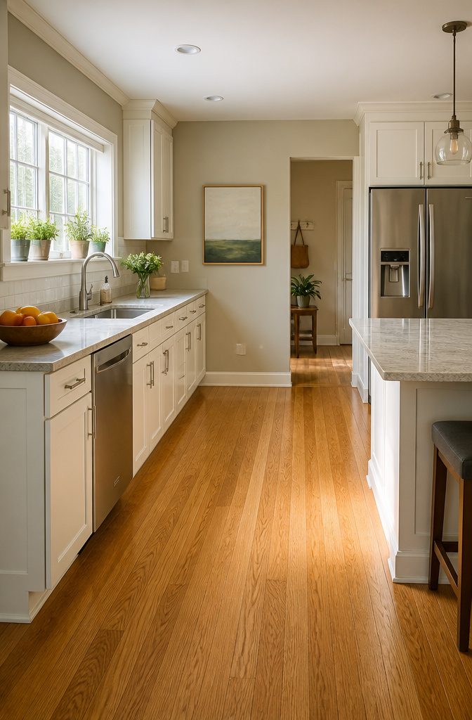
Golden oak floors carry a yellow undertone that reads dated in a lot of rentals and first homes built from the late 1980s through the early 2000s.
The warmth is not the problem; the problem is that yellow can look orange under certain light, and orange trim or walls beside it turn the whole room nostalgic in the wrong decade.
Cooler whites and neutral off-whites pull the room back toward current. Benjamin Moore’s White Dove on trim gives that clean edge without fighting the floor, and Stone Hearth on walls puts a modern beige between you and the oak’s glow.
Sherwin-Williams Extra White works the same way if you are already in that paint family.
Beige itself is a gamble here. Taupe or yellow-beige walls will amplify the undertone you are trying to quiet, so the beige that works is the one with enough gray in it to step back.
Soft grays do the same job more safely; they let the floor be warm without letting it run the room.
If you want something stronger, dark greens and deep blues like Sherwin-Williams Naval or Farrow & Ball’s Pigeon can modernize golden oak fast.
They read as intentional rather than apologetic, which is half the battle with a floor you did not choose.
7. Cherry Wood Floors
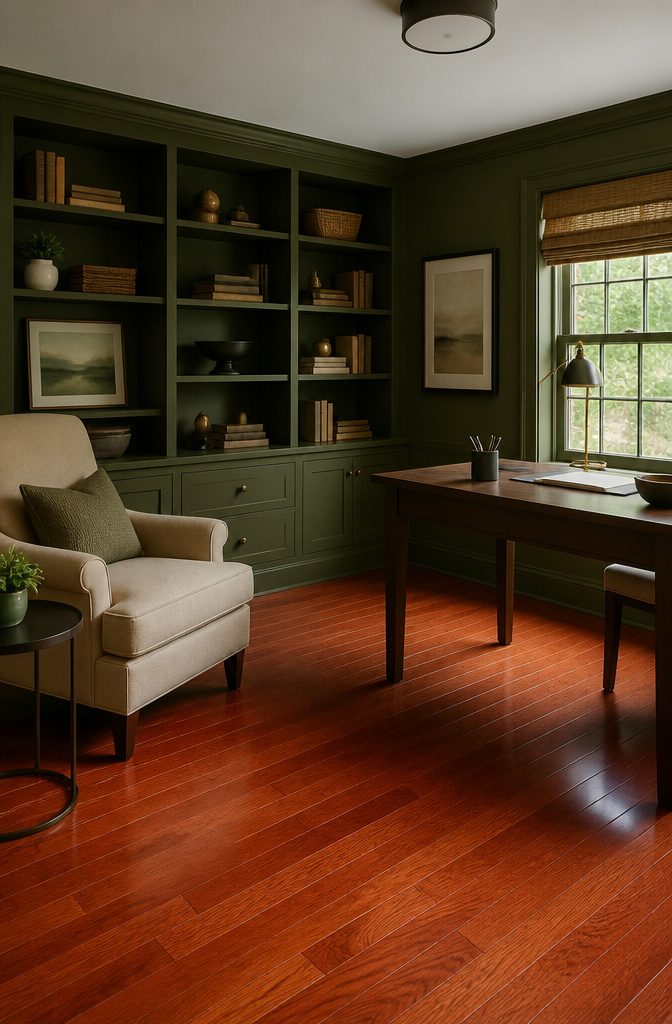
Cherry floors carry a red-pink undertone that deepens with age and light exposure, so the wall color you pick on a swatch may read differently six months in.
That shift is why deep green works as a complementary choice instead of a competing one.
Green sits opposite red on the color wheel, but a deep, earthy version like olive or sage quiets the floor rather than starting a shouting match.
Benjamin Moore’s Revere Pewter, a warm gray-greige, handles the same balancing act for a more neutral room.
Cool whites are the ones to skip. The same red-pink undertone that makes cherry floors glow will bounce back at you as a pink cast on the walls, and the reflection only gets stranger as the wood darkens.
Warm taupe, beige, or a light gray with some warmth in it softens the floor’s richness without that odd color bleed.
If you want something bolder, dusty navy or stormy gray cools the space without clashing the way an orange-leaning shade would.
Reading Your Floor’s Undertones
Wood floors read brown from across the room, but the color that actually drives your paint choice sits underneath that brown.
The same floor that looks neutral in the store can lean red, yellow, orange, blue, or purple once it lives next to your walls.
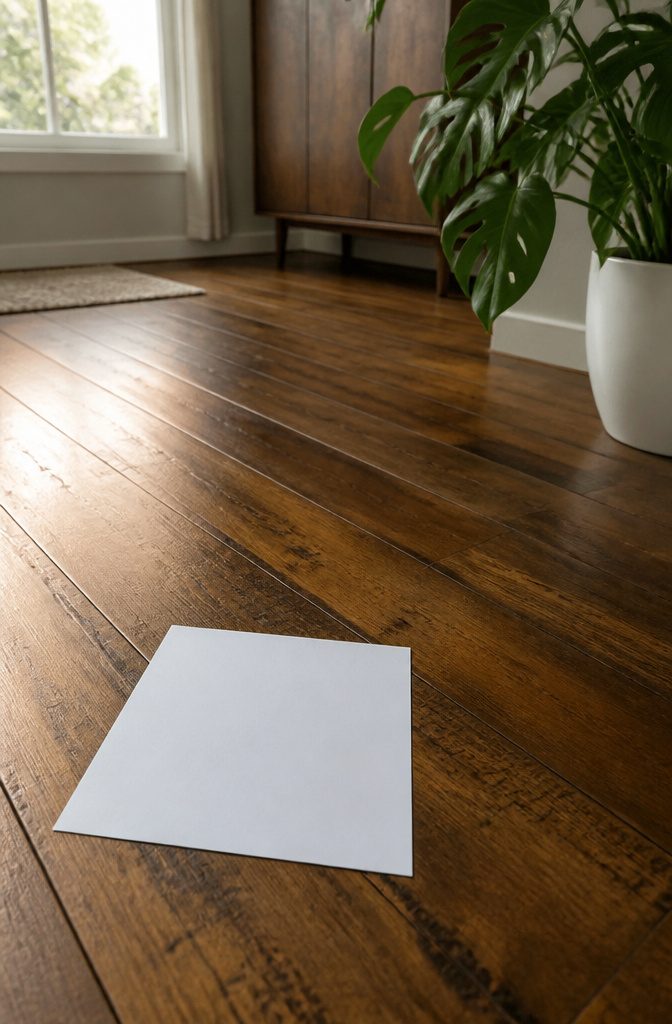
The white sheet of paper test makes this hidden color visible.
Lay a standard printer sheet flat on the floor and look at the wood against that pure white. Warm undertones, red or yellow, jump forward immediately.
Cool undertones, blue or gray, pull back and read flatter. The contrast strips away the ambient warmth of the room and shows you what the floor is actually doing.
Once you see which direction the floor leans, the rule is straightforward: pair it with its opposite. Warm floors need paint with cool undertones.
Cool floors need paint with warm undertones. Clash them and both colors fight.
A warm floor against a wall with too much yellow turns the room muddy. A cool floor against icy blue paint goes flat and cold.
Neutral paint, light gray or off-white, works as a safe middle ground when you need to stop guessing. It steps back from the undertone conversation entirely, which matters if you are painting now and selling later.
Testing Paint Before Committing
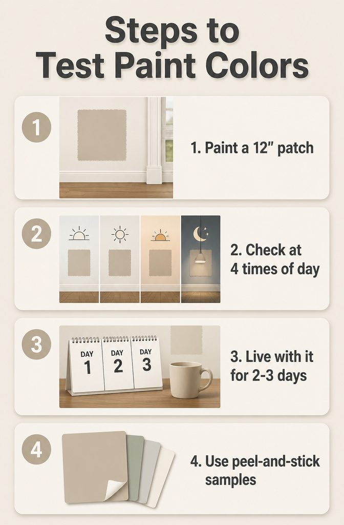
- Paint a patch at least 12 inches square directly next to your wood floor, right above the baseboards, and paint another swatch beside trim on a door frame or window so you see how the colors interact with every fixed surface in the room.
- Check the sample at four distinct times: morning light, midday, late afternoon, and under your artificial fixtures after dark, because that color you loved under the store fluorescents can shift to gray or go muddy once it meets your actual bulbs and your floor’s undertones.
- Live with the sample for two to three days before buying the full gallon; the color that felt calm on Tuesday can read entirely different once you’ve walked past it fifteen times with coffee in hand.
- Peel-and-stick samples at $5.95 let you move the same swatch wall to wall and room to room, which matters because the same paint color can look different in your bedroom versus your hallway even with the same floors.
Why Walls Stay Lighter Than Floors
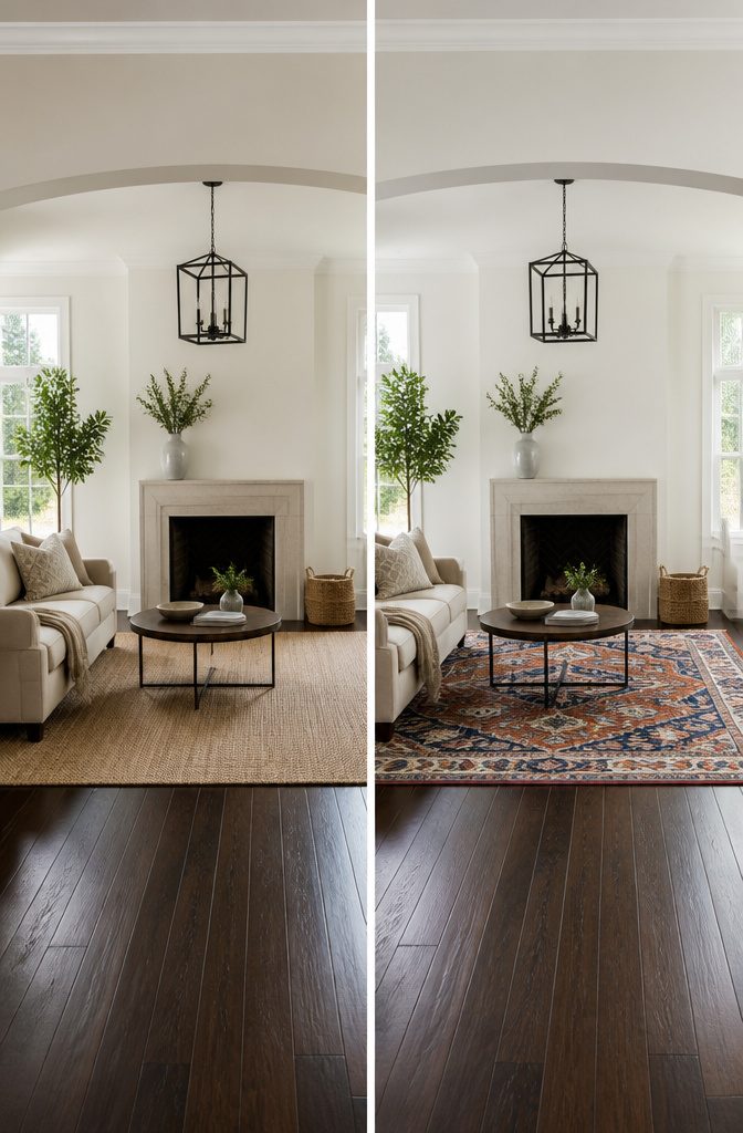
The consensus that walls should stay lighter than wood floors comes down to weight. Dark floors already pull the eye down; surrounding them with equally dark walls turns a room into a box.
The three-shade rule keeps that in check: pick a wall color at least three steps lighter on the same paint strip as the floor tone. One shade lighter looks like a mismatch, not a choice.
Two still feels off. Three shades does it: the floor reads as intentional grounding and the walls read as air.
Designers looking at a fan deck for dark wood floors often start with the lightest color on the strip, then move darker only for accents.
Natural light bends this, a north-facing room with already-gray light can handle a wall color closer to the floor without closing in, but that is the exception.
Smaller rooms especially need the lift. White walls against dark hardwood is the classic for a reason: it brightens, opens the space, and lets the floor’s richness do the work without competition.
An accent wall in a deeper shade can work if the remaining three walls hold the line.
Otherwise the room tips toward heaviness fast. Most weekend projects do not need that gamble.
Neutrals as the Safe Default
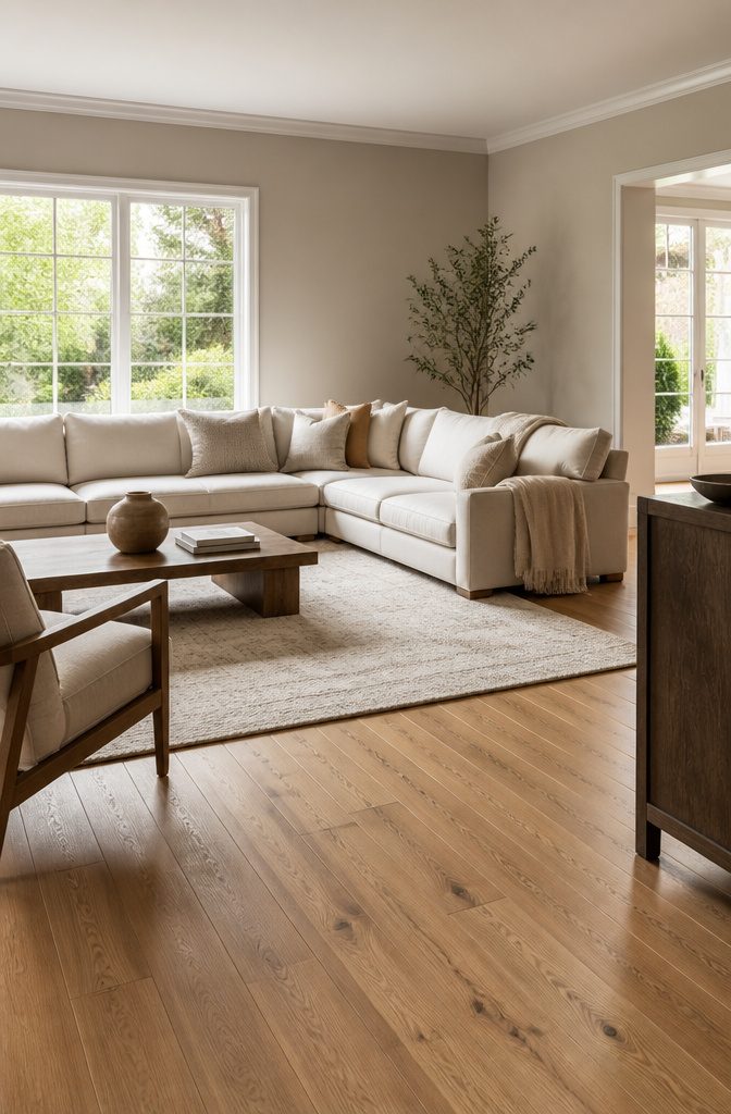
Neutrals earn their reputation because they buy time. A greige wall in a living room with both warm oak and cool ashy planks somewhere in the sightline won’t fight either tone.
Cream or ivory softens darker boards without announcing itself. Pale tan handles the transitional spots where one floor meets another and the undertones don’t agree.
But neutrals solve a problem only when you actually have one. In a single room with one consistent floor, reaching for beige because a blog called it safe is postponing a decision you could make now.
Warm neutrals, think Tavern Taupe or Simplify Beige, carry yellow or orange casts that read cozy against honey oak and terrible against weathered gray.
Cool neutrals like Colonnade Gray or Magnetic Gray lean blue or green; they flatter ashy planks and turn oak flat. Greek Villa and Natural Linen sit near the middle, bright enough to let the wood do the talking.
The real mistake is treating "neutral" as a category without temperature.
Test the chip against your floorboards in morning light, not just under the store fluorescents. A warm neutral on cool flooring looks dirty.
A cool neutral on warm flooring looks institutional. Either mismatch costs another Saturday and another gallon.
Adding an Accent Wall
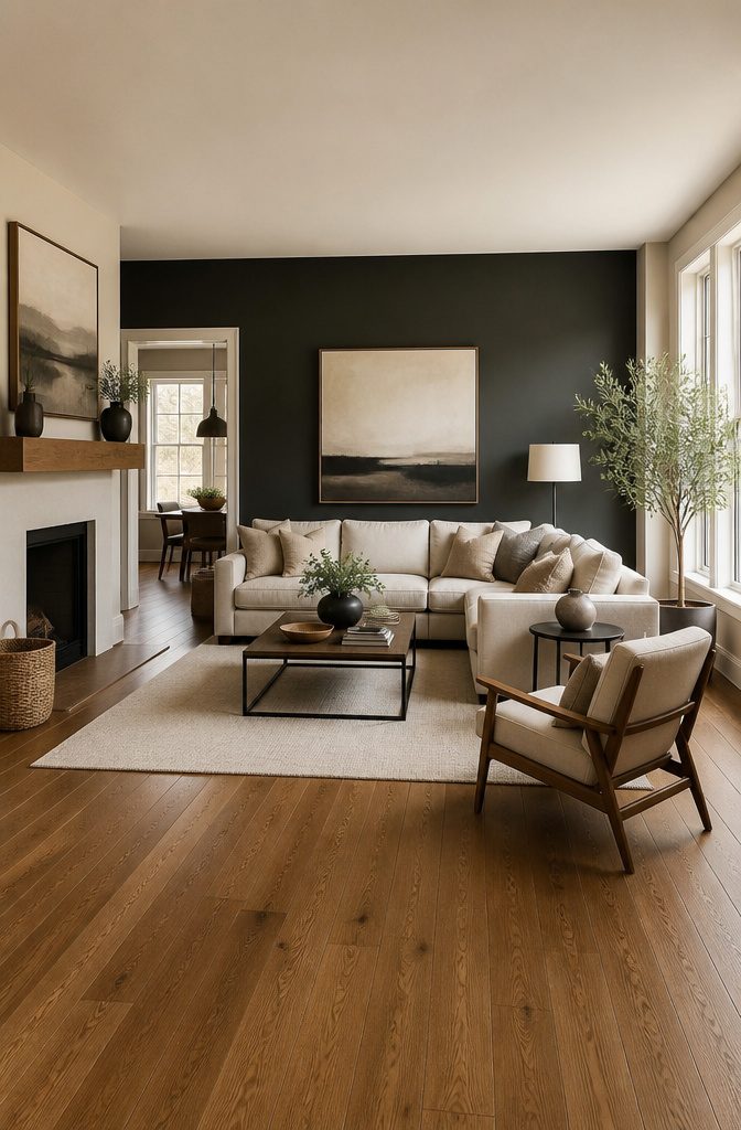
Accent walls let you bring in a darker or bolder color without boxing the room in.
Choose the wall you see second, not first. When someone walks through the door, the accent wall should sit off to the side or behind a main piece of furniture, not straight ahead.
That back wall behind the sofa or the headboard wall in a bedroom works; the wall facing the entryway usually fights the floor for attention.
If your floors run warm, the accent color needs to pick up that warmth. A navy that carries a little gray can work with cool floors; a navy that leans purple will look off against honey oak.
The same rule holds for darker grays and charcoal. One source recommends moving two or three steps down the same paint swatch you used for the main walls, rather than grabbing a random bold color.
The common mistake is treating the accent wall as the feature wall. In a room with dark wood floors, a dark accent color on the first visible wall swallows the space.
Keep the other walls light, at least three shades lighter than the floors, and let the single darker wall read as depth rather than a cave.
White wainscoting or a chair rail can split the difference in a dining room, with white below and the darker color above.
Frequently Asked Questions
What color goes with oak flooring?
Cooler whites and neutral off-whites pull oak back toward current style, while soft grays step back safely. Beige is a gamble; taupe or yellow-beige amplifies the undertone you are trying to quiet, so pick one with enough gray in it.
Dark greens and deep blues like Sherwin-Williams Naval or Farrow & Ball’s Pigeon can modernize golden oak fast by reading as intentional rather than apologetic.
Should walls be darker or lighter than floors?
Walls should stay lighter than wood floors. Dark floors already pull the eye down, and surrounding them with equally dark walls turns a room into a box.
The three-shade rule keeps that in check: pick a wall color at least three steps lighter on the same paint strip as the floor tone.
One or two shades lighter looks off; three shades does it, so the floor reads as intentional grounding and the walls read as air.
How can I tell the undertones of my hardwood floors?
Lay a standard white printer sheet flat on the floor and look at the wood against that pure white. Warm undertones, red or yellow, jump forward immediately.
Cool undertones, blue or gray, pull back and read flatter. The contrast strips away the ambient warmth of the room and shows you what the floor is actually doing.
Once you see which direction it leans, pair it with its opposite: warm floors need paint with cool undertones, cool floors need paint with warm undertones.