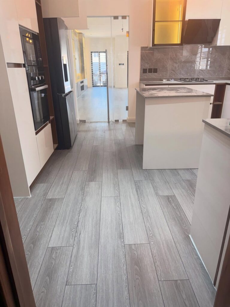
Kitchen floor colors run from a weekend paint job to porcelain plank installs that cost more than refinishing ever would. Your situation decides how permanent a choice you can make, not how bold you want to go.
I would spend 2 days with taped-down samples under actual bulbs before committing to any of them, since the same beige shifts from fresh to flat depending on the light.
[link-whisper-related-posts]1. Light Neutral Floor Colors
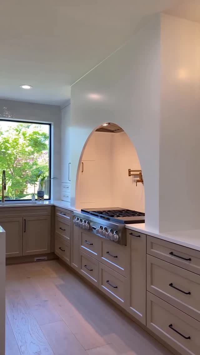
Beige planks underfoot keep a kitchen feeling open without fighting the cabinets for attention.
I like this approach for renters who need one change to pull the room together, since light neutrals read as fresh without demanding new countertops or hardware.
Stay in the warm range, sandy rather than gray, so the floor does not go cold against white appliances.
Terrazzo in cream and amber flecks hides coffee drips better than solid color, and basket-weave marble tile adds texture if you are replacing flooring anyway.
This suits kitchens that get morning light; in a dark galley, the same beige can read as flat. A tighter grout line on tile keeps the surface practical for a space that sees daily cooking.
2. Wood-look Porcelain
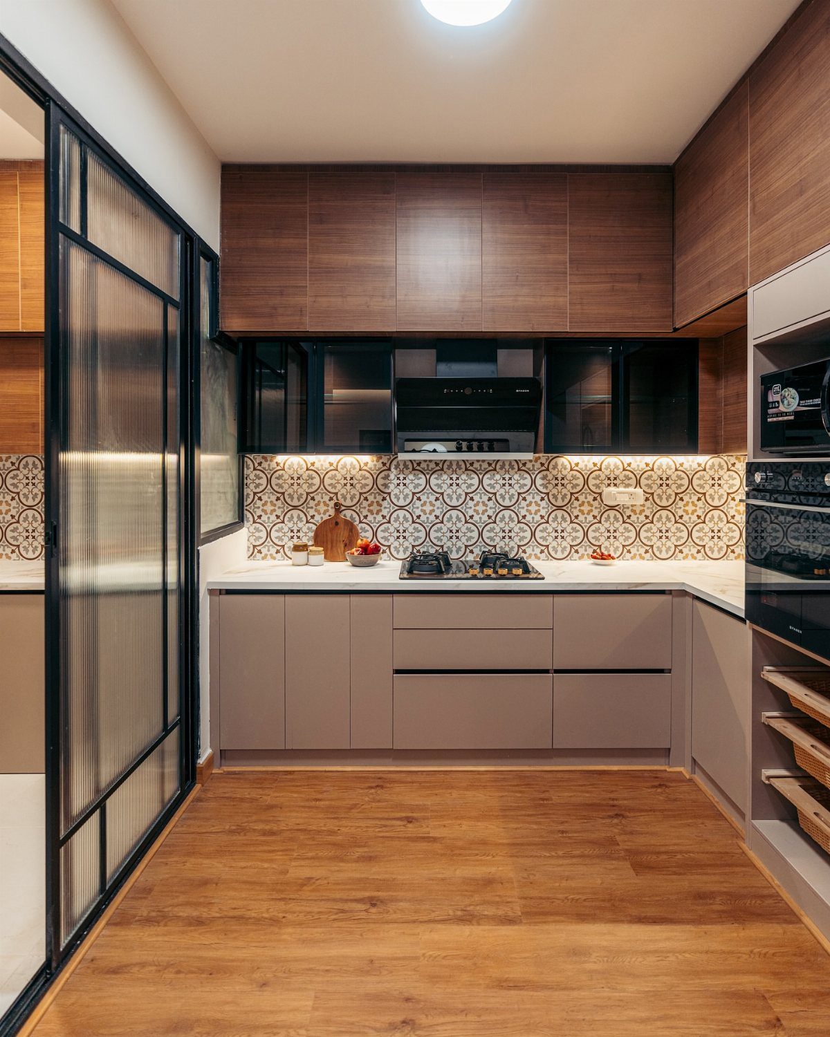
Porcelain planks give the warmth of oak without the panic over a dropped pot of pasta water.
I put this high on the list for anyone with kids, dogs, or a habit of cooking while half-awake; the surface shrugs off scratches and standing puddles alike.
Medium brown with visible grain reads as real wood from a few steps back. Lighter oak tones work better in a small kitchen, bouncing what light you have, while walnut-inspired shades suit open plans where the floor needs weight.
Cost runs higher than sheet vinyl, but you skip the maintenance cycle of refinishing. A tight grout joint sells the plank illusion; wide grout breaks the effect and traps grime.
3. Light Brown Floor Colors
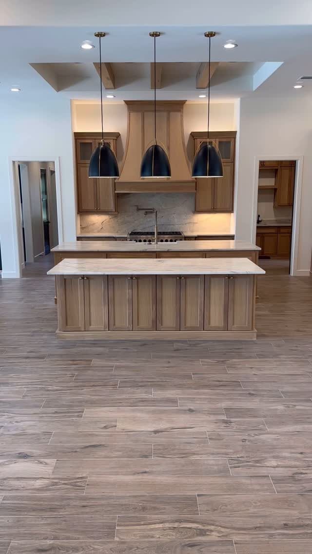
Warm brown tile bridges rustic and modern without committing full farmhouse. Porcelain with tight grout lines makes a double-island setup practical for actual cooking.
Terracotta-adjacent tones blend with wood cabinets and stone counters already in place, so this fits a refresh rather than a gut renovation.
I would use this color family when the existing palette feels too cool and sterile; it adds warmth without the drama of a pattern.
Luxury vinyl plank in similar tones runs cheaper and softer underfoot if you are laying it yourself over a weekend. Shorter life span in a high-traffic kitchen is the downside.
4. Hexagon Tiles
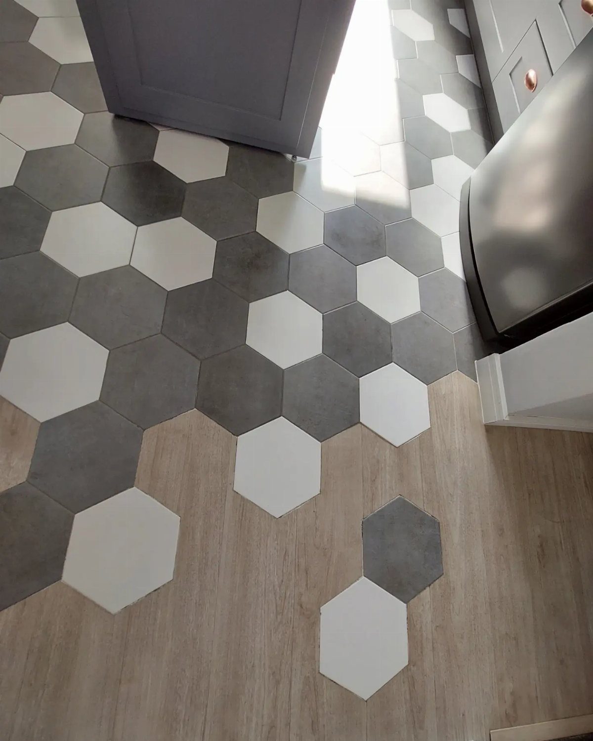
A hexagon mix breaks up the floor plane without the formality of a border or inlay. An uneven transition, wood meeting tile at a ragged edge, works because both materials stay in the same gray value range.
I would use this shape where slip resistance matters; the grout lines add grip that large-format porcelain lacks. Alternating two colors, white and dark gray, keeps the pattern from going dizzying.
Three or more colors and the kitchen starts reading as a patio.
Small hex mosaics in stone or porcelain suit older homes with less-than-flat subfloors, since the grout lines forgive slight unevenness. The cleaning tradeoff is real; more grout means more scrubbing, or at least more sealer at install.
5. Checkerboard Patterns
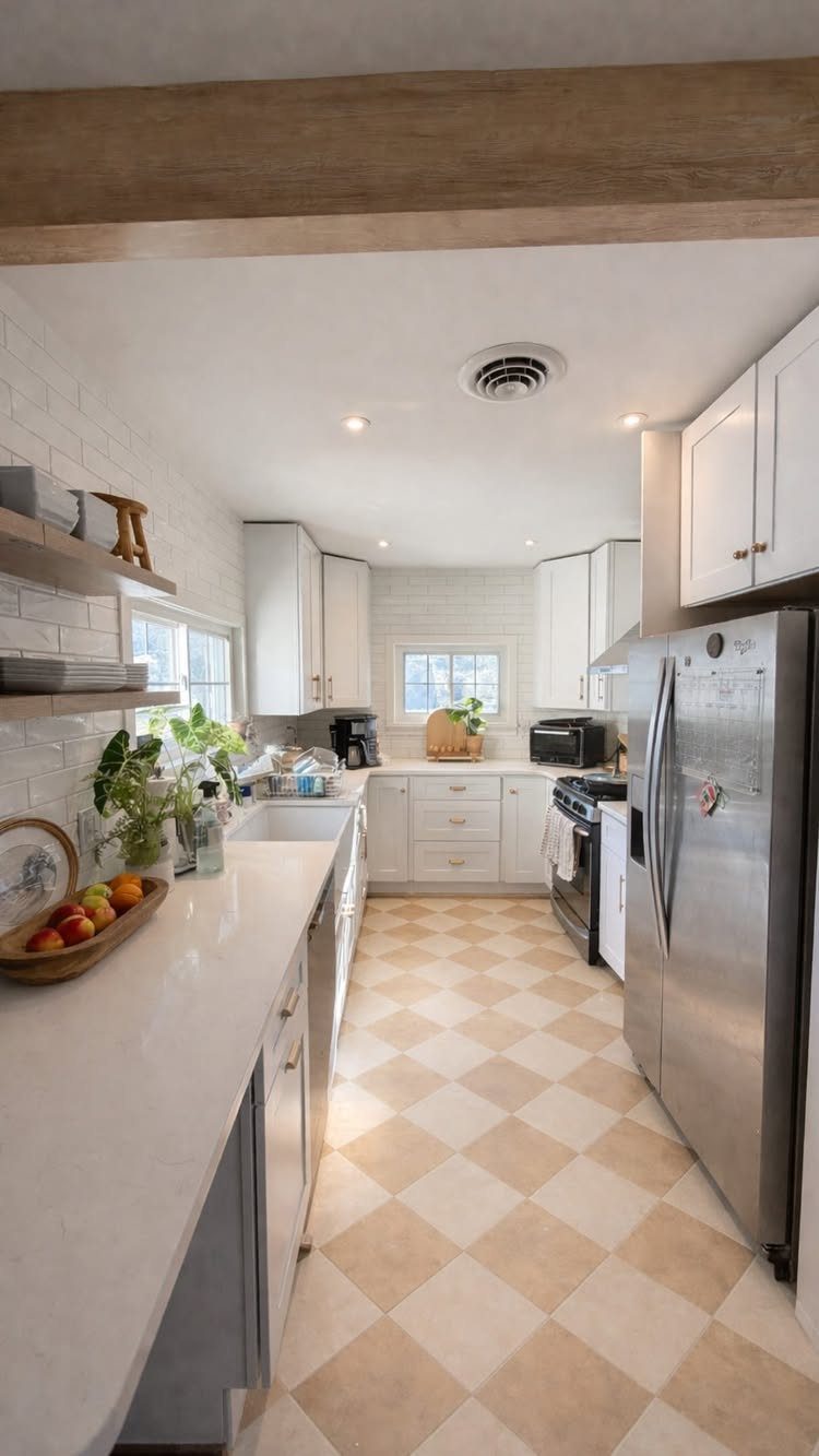
Two-tone squares in cream and beige give a narrow kitchen the illusion of width, drawing the eye across rather than down the galley.
I have seen this pattern work in rentals where the landlord left decent white cabinets but nothing else worth keeping.
The Parisian cafe reference is fair, though the softer tones here avoid the high-contrast formality of true black and white.
For a DIY tile job, this is forgiving; a slightly off square gets lost in the rhythm, unlike a herringbone where every misalignment shows.
Cost stays moderate since you are buying 2 standard colors, not a designer pattern. Cement tile versions need sealing yearly; porcelain or ceramic skips that chore.
6. Artistic Patterns
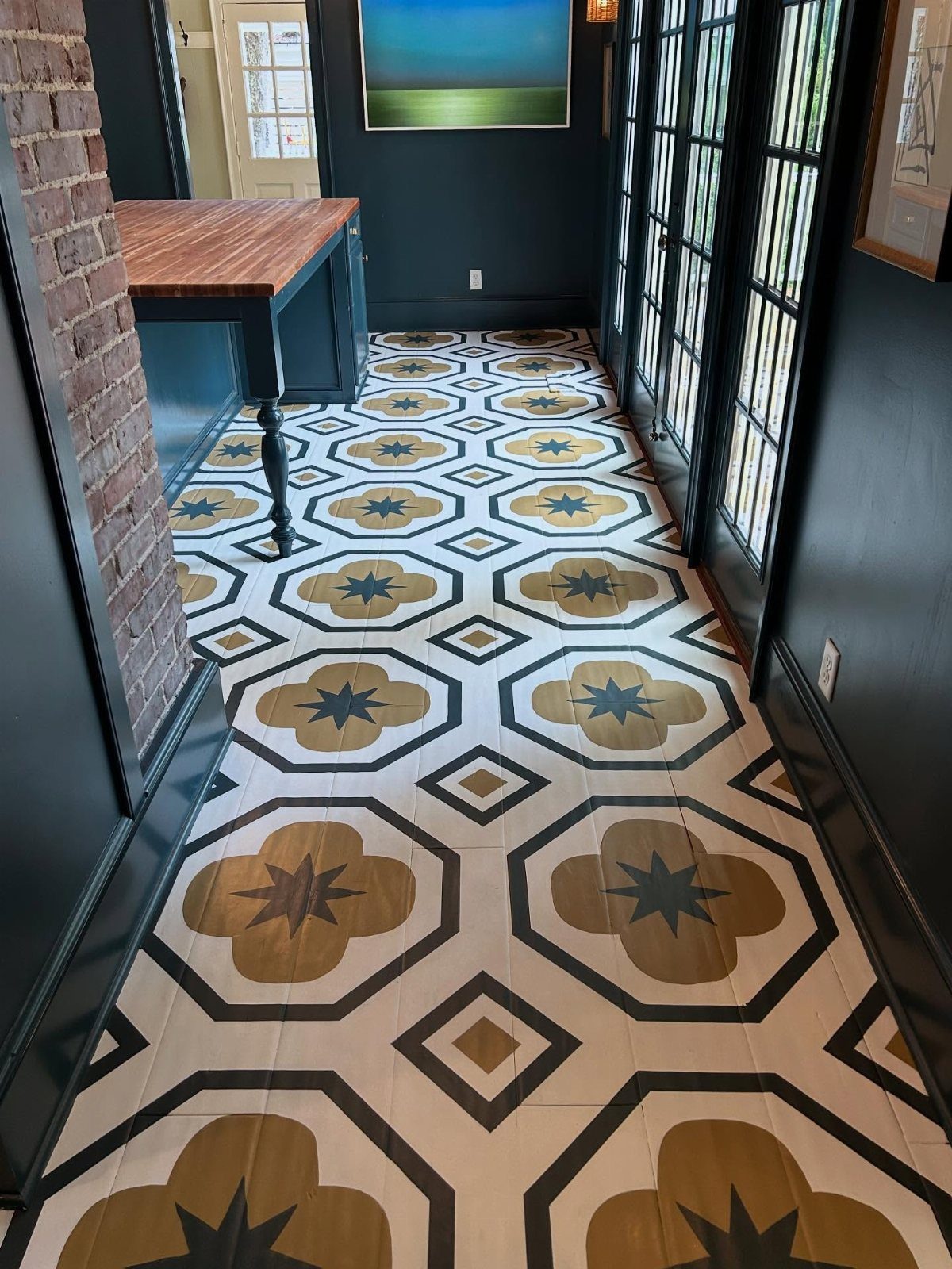
A floor painted with geometric motifs turns the kitchen into the house’s most interesting room without touching the cabinets.
Gold and dark teal on a light ground reads as intentional rather than busy when the wall color picks up the darkest tone.
I would not attempt this on raw wood unless you enjoy sanding between coats; painted plywood or existing tile takes the design better and costs less to fix if you hate it later.
Stencils run cheap, plus primer and porch-grade paint that can handle foot traffic.
This suits the confident DIYer with a steady hand and a weekend to lose. Maintenance is the downside; touch-ups show, and a full refinish means starting over.
A patterned vinyl mat in a similar motif gives most of the look with zero permanence.
7. Testing Floor Color Samples
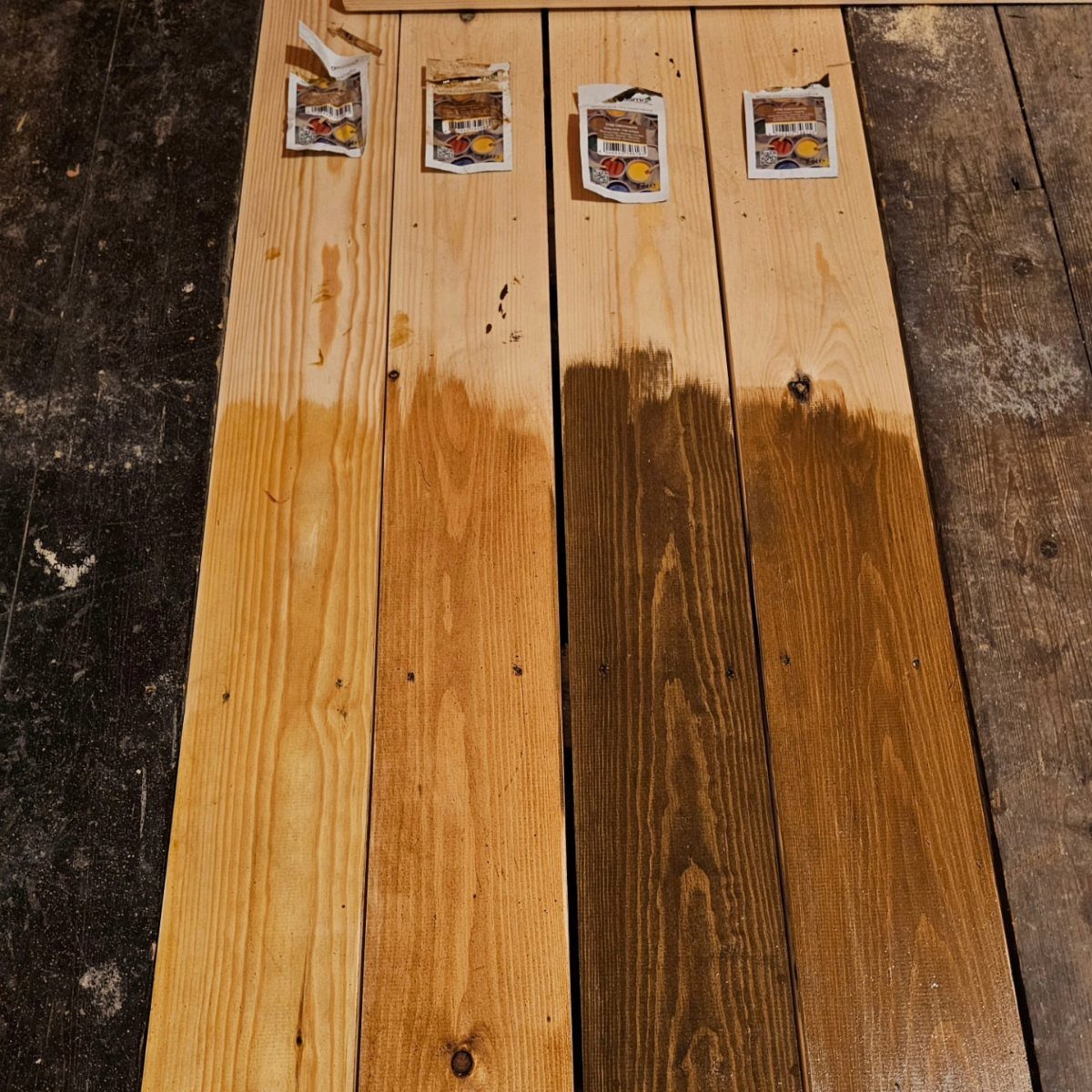
A stain sample on a board tells you almost nothing until it sits on your actual floor, under your actual lights, next to your actual cabinets.
Morning sun through the window, the warm cast of Edison bulbs after dinner, the flat overhead fixture you flip on at midnight: the same plank shifts across all three.
I tape samples down and live with them for 2 full days minimum, checking at each light change. Hold them against your countertop and backsplash, not just in isolation.
A color that reads neutral in the store can pull green or pink against what you already own. If you are still stuck, some flooring shops will bring a wider set to your kitchen and walk the choice with you.
8. Herringbone Elegance
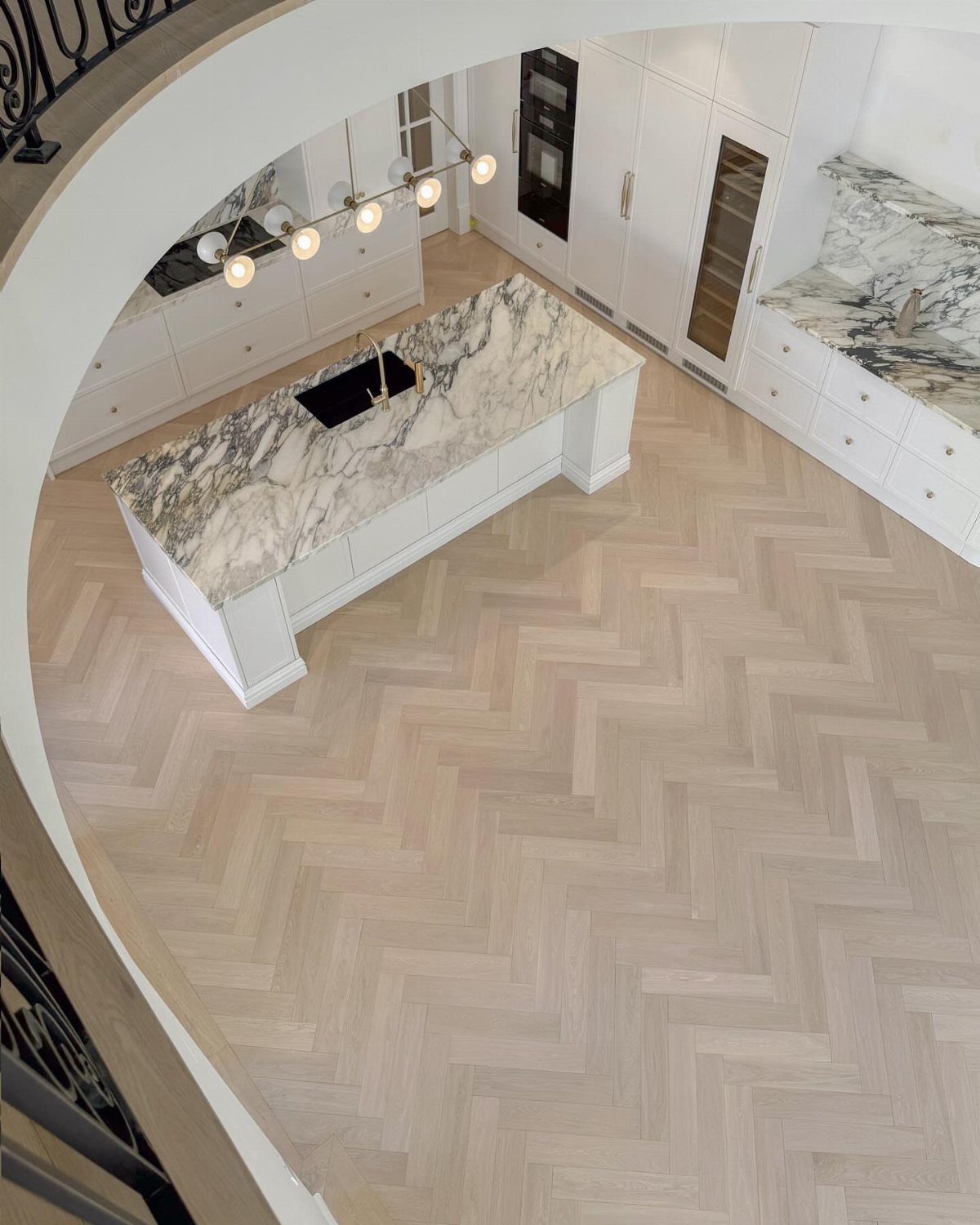
Herringbone reads as expensive even when the material itself is mid-range laminate. The pattern does the work, not the price per square foot.
I would not try this in a galley kitchen where the geometry has no room to repeat; it looks chopped off instead of flowing.
The angle also eats more material, so order extra over your square footage instead of the usual buffer for standard layouts. For a Parisian feel, keep the tone light and consistent; high contrast between planks turns busy fast.
This pattern suits someone who wants one bold move without committing to color.
9. Gray Floors
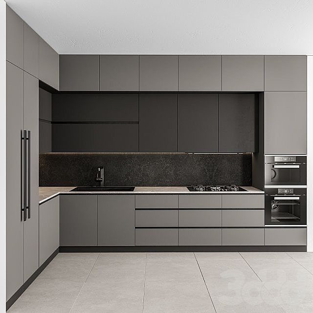
Gray floors live or die by undertone, and the cabinet color decides which one you need. Cool gray cabinets with blue or green in them want floors in the same family: pale ash, cool beige, light blonde LVP.
Warm gray cabinets can handle something with brown or yellow beneath it. The clash to avoid is gray cabinetry against wood with strong red or orange tones, like classic cherry; it fights instead of complements.
For a monochrome look, try greige cabinets a shade lighter or darker than the floor. Concrete-look rigid core vinyl suits an industrial kitchen without the coldness of actual stone underfoot.
10. Large-format Tiles
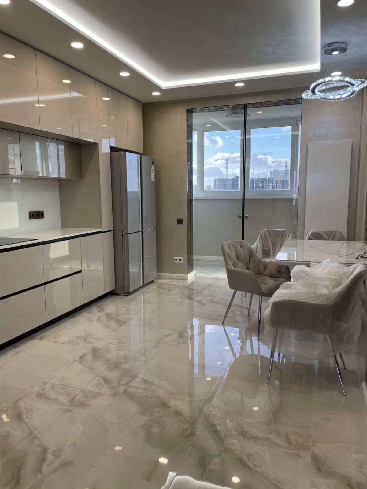
Big tiles mean fewer grout lines, and fewer grout lines mean the floor reads as one continuous surface. In a small kitchen, that visual stretch matters more than the tile color itself.
Tile is cold, hard, and unforgiving if you stand at the stove for an hour. I would not put it in a kitchen where someone cooks daily unless they add a thick mat at the prep sink.
Polished marble-effect porcelain like this reflects light upward, which helps a room with limited windows. Order a box, lay a few tiles dry in your space, and check the veining before you commit; some batches run busy, others nearly blank.
11. Terracotta Floor Tiles
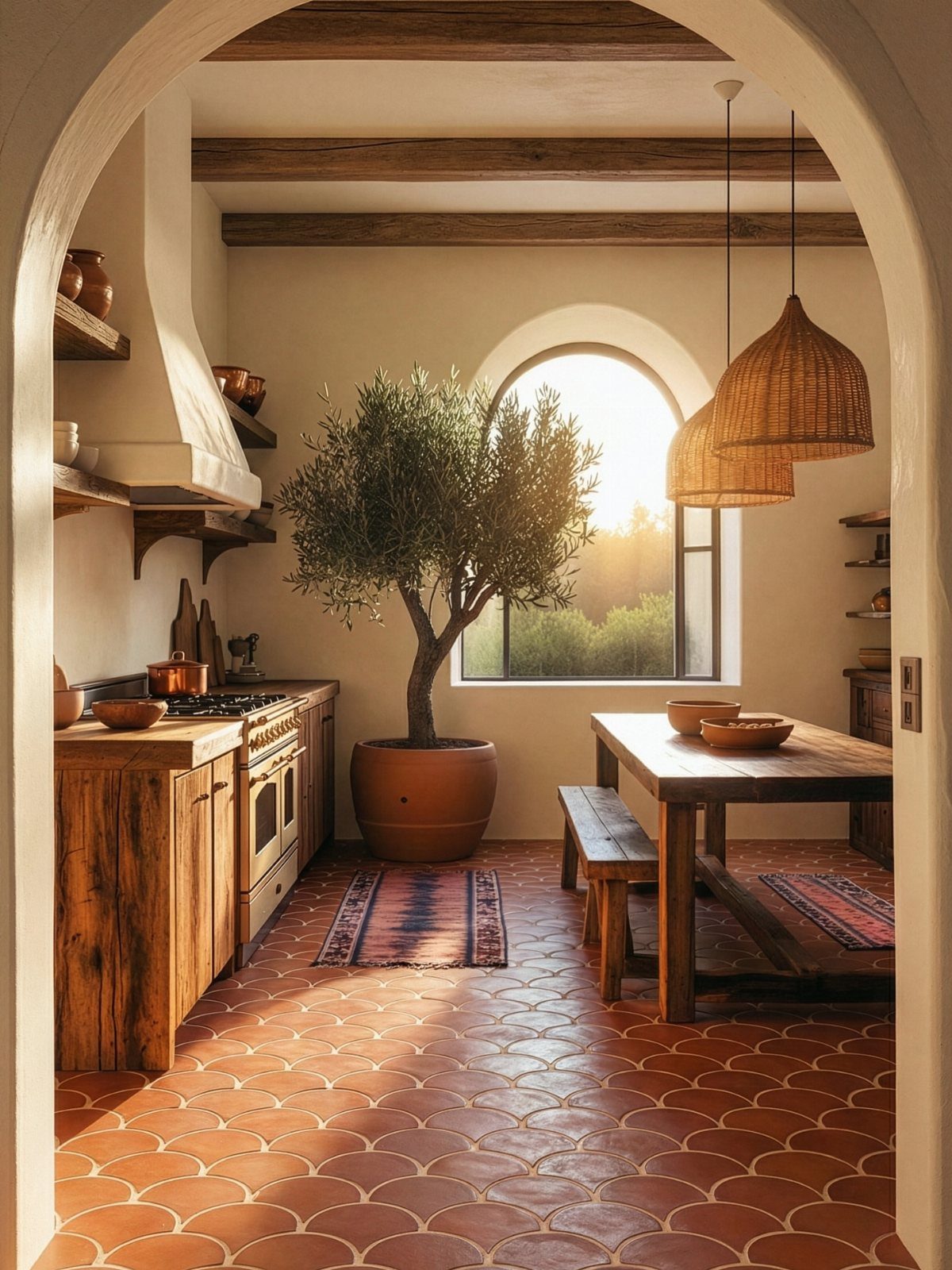
Terracotta brings in warmth that manufactured materials struggle to fake, and the handmade versions carry variation that hides crumbs and dog hair better than a uniform surface.
The scalloped or antique edges in some styles add texture, but they also collect more dirt in the grout; I would seal these floors yearly if I chose them.
This look roots a kitchen in Mediterranean or farmhouse territory, so it needs wood cabinets with some grain and patina to feel intentional, not mismatched. Modern flat-panel doors can make terracotta look like a leftover instead of a choice.
If the real thing is too porous for your spill rate, porcelain now copies the color and wear patterns without the staining risk.
12. Light Blonde Wood Floors
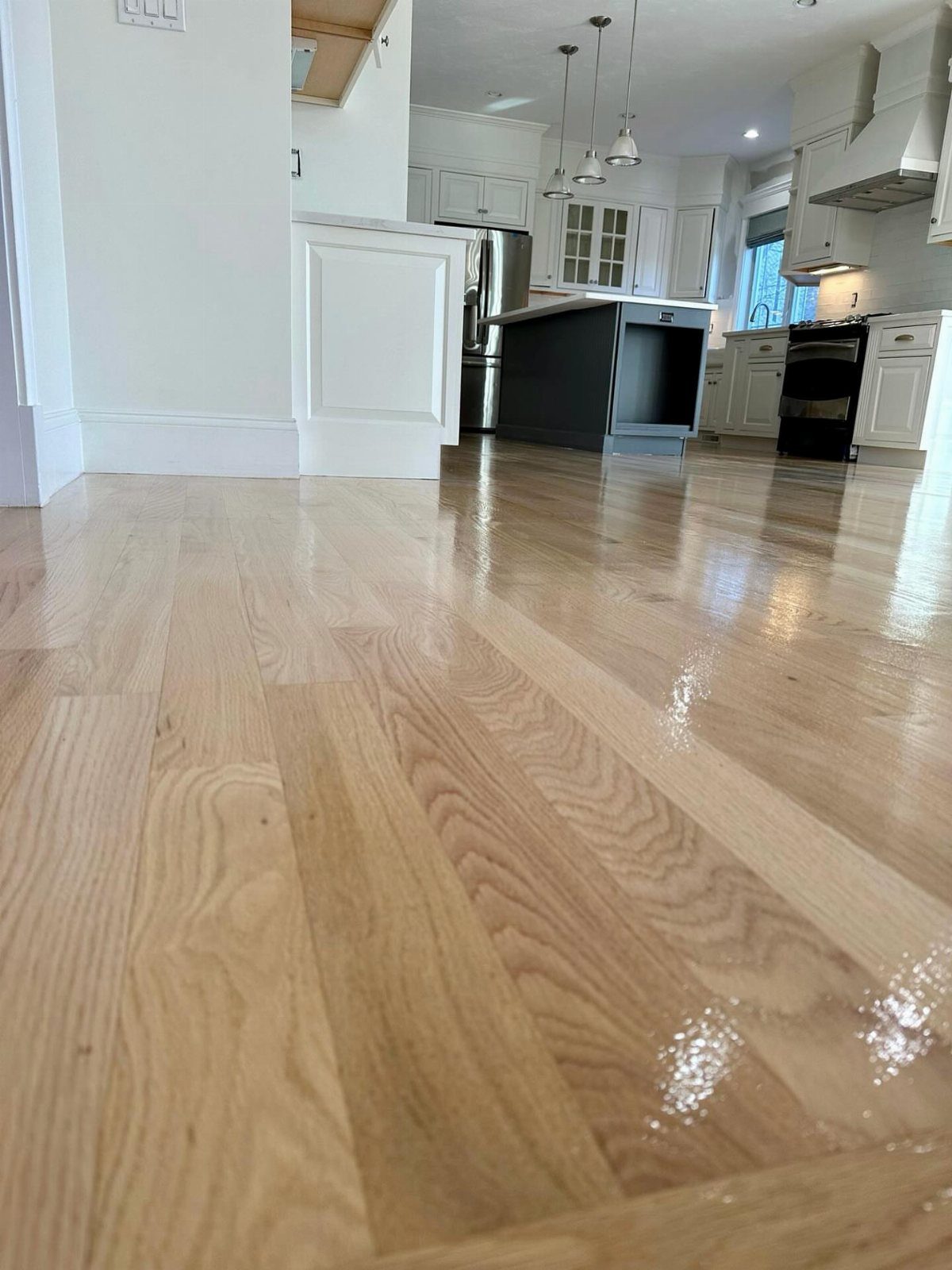
Pale wood floors bounce light around a room and make white cabinetry feel intentional rather than sterile. High gloss with kids or a dog means every scratch catches light and announces itself; matte or satin forgives more.
Engineered hardwood like this extends into adjoining rooms without the swelling risk of solid planks near a dishwasher or sink. For a modern loft, the contrast of black cabinets against blonde wood reads as designed rather than decorated.
In a traditional space, keep the cabinets warmer and let the floor do the brightening alone.
13. White Tile with Black Accents
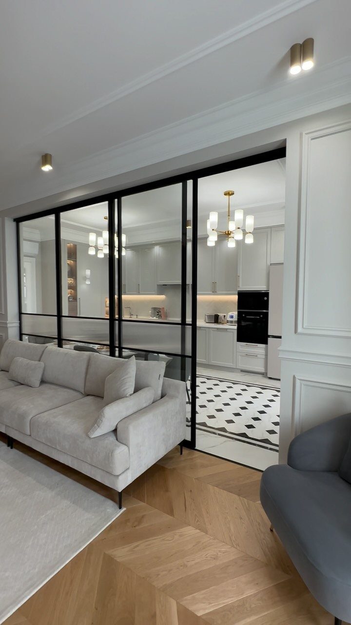
Black diamond inserts turn plain white square tile into something with actual personality without demanding a full pattern commitment.
I saw this done in a ranch revival where the homeowner laid white porcelain field tile and set small black accent diamonds at the intersections, four per tile.
The black fridge and cabinet hardware in that kitchen pulled the floor into the room instead of letting it float underneath.
Grout color matters more here than with solid tile. Dark grout with white tile and black accents turns the grid into a checkerboard you didn’t plan; matching the white keeps the diamonds as the point.
I’d spend the extra on a grout sample board before the full batch.
This suits someone who wants graphic impact but needs the wipe-clean surface of porcelain. Natural stone in black and white exists, but the porosity fights a kitchen’s traffic.
Save that for the bath.
14. Multicolor Splatter Kitchen Floor
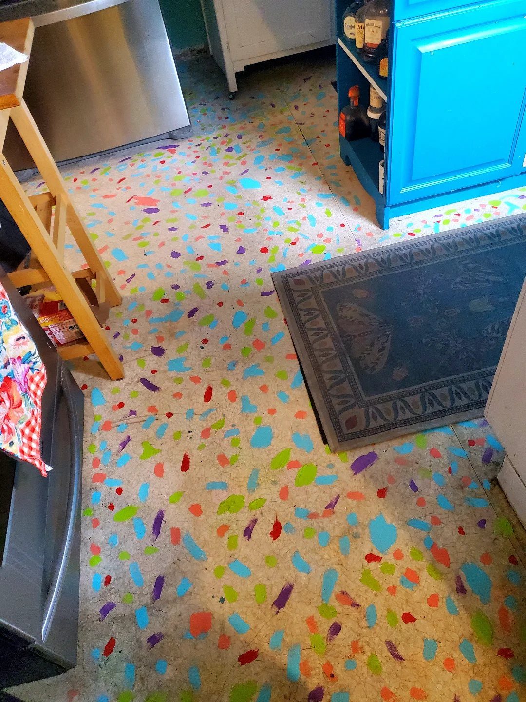
A splatter floor starts with a base coat in something forgiving, beige or light gray, then builds color in layers that overlap enough to hide any single mistake.
Porch and floor enamel, not wall paint, is what holds up here; the alkyd base hardens enough that a dropped can of tomatoes won’t lift the purple spot underneath.
I would prime with a dedicated concrete or wood floor primer first, even over existing paint, or the new coat chips at the edges where the stool scuffs.
Small test boards save this project.
The same red reads orange over yellow primer and burgundy over gray, and the whole effect depends on density: too sparse looks like a drip accident, too dense loses the individual colors in brown mud.
I laid out 3 test boards and lived with them for a week before touching the actual floor.
This is for the reader who hates every neutral option in the tile aisle and has a weekend where perfection isn’t the goal.
Renters with landlord approval can do this over existing linoleum and roll it back to beige on move-out.
Color Psychology in Kitchens
Warm floors do something cool ones cannot. A terracotta or honey-toned plank makes a kitchen feel occupied, lived-in, ready for someone to sit down with coffee.
Cool gray or pale ash does the opposite; it quiets the room, which suits a space that already has noise enough from appliances and traffic.
Neutrals split the difference, though they need texture to avoid reading as absence rather than choice. The beige in the list works because it carries warmth; a grayed-out neutral drains energy without adding calm.
I would match the tone to the hour the kitchen gets used most. Morning cooks need the lift of warm color; midnight snackers might prefer the settled feel of a cooler floor.
Matching Floors with Cabinets
Dark cabinets swallow light, so the floor has to return it. The contrast builds depth the same way a photograph needs shadow and highlight to read as three-dimensional.
Match the cabinets too closely and the kitchen flattens. Walnut-on-walnut only works when the room is large and the windows generous; otherwise the eye has nowhere to rest.
With very dark cabinets in a low-light space, I would stay in the light-to-mid wood range and avoid anything that approaches the cabinet depth.
Dark green or navy cabinetry gets medium oak or walnut; the warmth keeps the color from going cold without competing for attention.
Maintenance Considerations
Smooth tile shows everything. A dropped onion skin, flour dust, water spots: they all sit on the surface until you wipe.
Textured porcelain or a hand-scraped wood-look plank hides the same debris between its ridges, buying time between cleanings.
Light colors do not always show more dirt than dark ones. A medium-tone floor with variation in the grain or stone pattern breaks up the visual field better than solid black, where every dust mote catches the overhead light.
The terrazzo and splatter options in the list work partly because their busy surfaces forgive daily life.
Porcelain and glazed ceramic skip that cycle, which is part of why they dominate rental kitchens.
Frequently Asked Questions
What is the best floor color for a kitchen?
If I were starting fresh and wanted the safest bet, I’d go with a light neutral in the beige family.
It opens the room up and doesn’t force you to swap out countertops or hardware just to make everything play nice.
When the rest of the house runs cool and the kitchen feels like it doesn’t belong, a warm brown ties things together.
For high-traffic homes, medium brown wood-look porcelain holds up against kids and dogs without looking like a public restroom floor.
What are the trends for kitchen flooring in 2026?
The shift away from cool gray has been building for a while. What I’m seeing now is light white oak and honey tones moving in, anything that reads as actual wood rather than processed gray plank.
Checkerboard patterns in softer cream and beige are showing up in narrow kitchens and rentals. Wood-look porcelain in wider planks, matte finishes, and earthy hues like terracotta and muted beiges are also gaining ground for 2026.