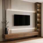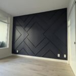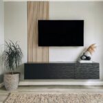
These ideas run from a Saturday with a gallon of paint to a weekend of cutting and nailing boards, and the right choice depends on whether you can paint back later or own the wall outright.
Renters testing color will land on painted arches or removable wallpaper; owners ready to cut and nail will find board and batten the gentlest entry.
[link-whisper-related-posts]1. Painted Accent Wall
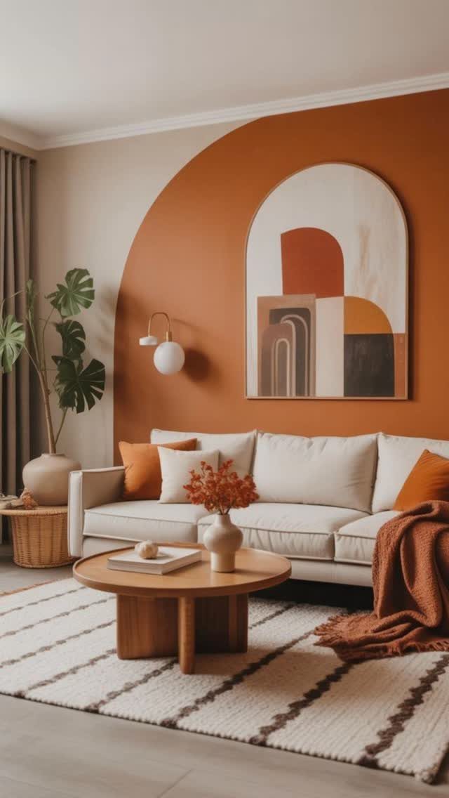
Paint can shift a whole room for the price of a gallon and one Saturday. Painter’s tape laid freehand in an arch, then filled with a saturated terracotta, gives a plain wall a shape that reads as built-in.
I’d skip the safe near-neutrals. A deep teal, smoky charcoal, or warm earthy green gives the wall a reason to exist.
Roll the base color first, let it cure overnight, then tape your shape and cut in with a brush before rolling the second coat.
This suits renters who can paint back later, or anyone testing whether they can live with color before committing to wood or stone.
Flat paint leaves the texture to your furniture and art, which is fine if you already own pieces worth showing off.
2. Board and Batten Accent Wall
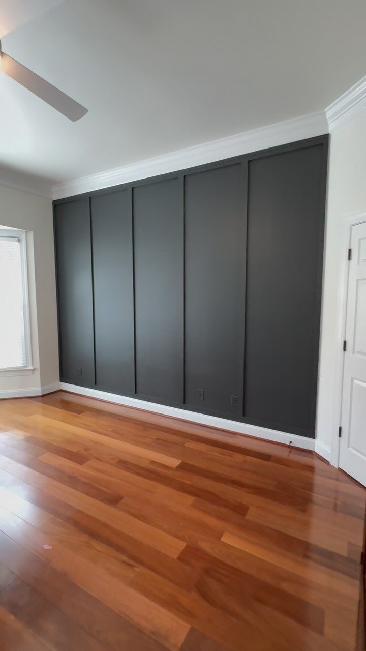
Board and batten is the accent treatment I’d point to first for anyone nervous about carpentry. Pre-primed MDF strips cost pocket change, the cuts stay straight, and the finished wall looks like far more work than it was.
Floor-to-ceiling battens in dark charcoal between white trim let the wall read as architecture instead of something you hung there.
Install a flat base panel first, then space vertical battens with a horizontal top rail to cap it; eyeball the spacing against your wall length rather than locking into a rigid interval.
Caulk every seam before painting, or the gaps telegraph through. This fits nearly every style; the only homes I’d skip are ones already heavy with trim everywhere else.
3. Stone Accent Wall
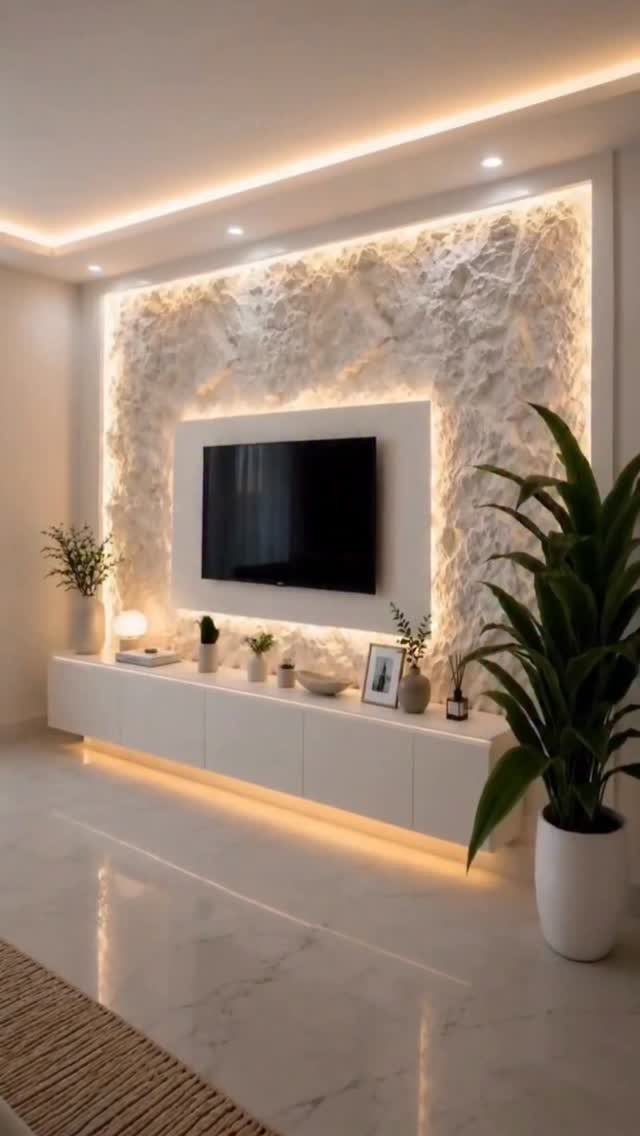
Stone reads as permanent, which is exactly what some living rooms need. White stacked stone lit from above and below with LED strips casts small shadows even at night, so the texture stays alive after dark.
Real stone carries weight and cost; faux panels glue up lighter and cut with a circular saw. Check your wall framing before you decide.
Real stone needs blocking behind drywall to bear the load; faux often does not.
Around a fireplace, either version handles heat fine. Elsewhere, the choice depends on whether you want the variation of natural pieces or the consistency of manufactured ones.
I’d go real only if the wall is the room’s single focal point and the budget allows.
“Adding a stone wall in the living room was the obvious choice to accomplish this, plus it was the perfect way to highlight a rustic modern style.”
4. Wall Murals
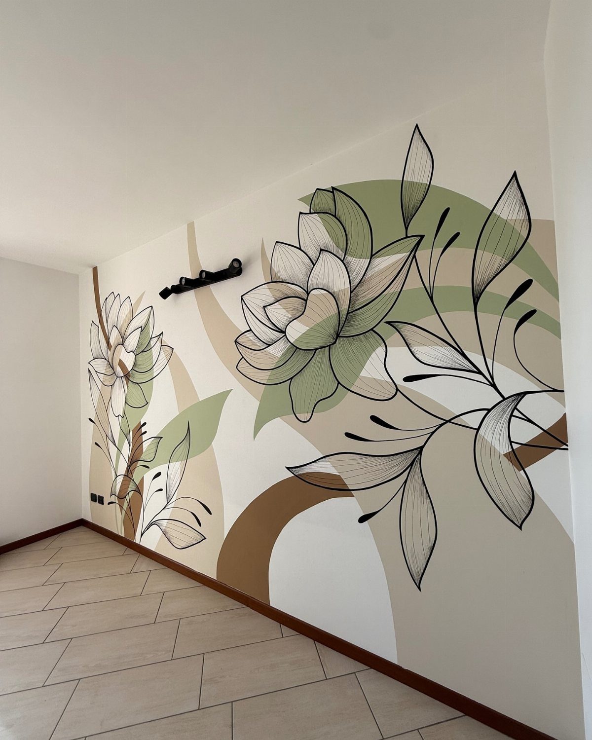
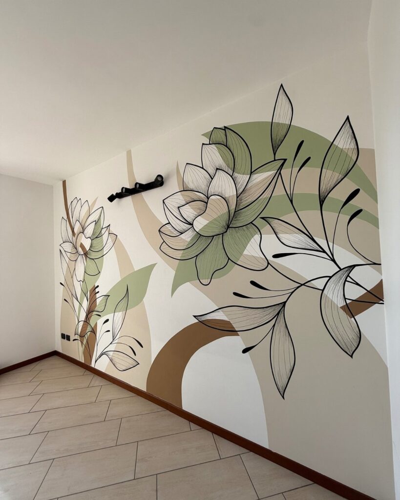
A mural turns one wall into a single large image instead of a color field. A floral mural, hand-painted or printed to scale, works when the line work stays loose enough to read as art rather than wallpaper.
Removable vinyl murals peel off when you’re tired of them, which matters if you change tastes every few years.
Custom printing from your own photograph is available, though I’d stick to the company’s image bank unless you have a high-resolution file that can scale to wall height without pixelating.
Prep matters more than with paint. Every bump and patched hole shows through a large flat image, so skim-coat first.
This idea shines in rooms where you want atmosphere without shelves or objects competing.
5. Bold and Black Accent Wall
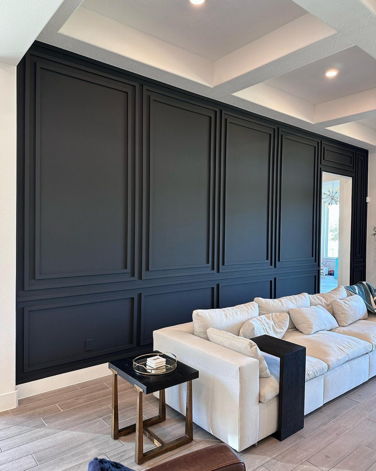
Black paint does the opposite of what most accent walls try. Instead of receding, it advances; instead of brightening, it absorbs.
Picture frame molding in matte black catches light on its edges and keeps the surface from reading as a void.
Sherwin-Williams Tricorn Black is the shade I’d start with, deep enough to stay black in artificial light without tipping toward navy.
This demands a room with enough natural light or enough white and wood nearby to balance it. Small, dim living rooms will feel smaller.
Black gives artwork a gallery-like depth and a sophistication that colors struggle to match.
6. Industrial Edge Accent Wall
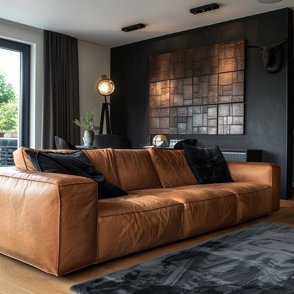
An industrial edge wall borrows from warehouses: raw brick, distressed metal, concrete textures. A charcoal wall with a gridded metallic art piece and a mounted animal head shows the softening elements that keep the room from feeling like a loft.
Brick veneer panels give the look without structural masonry; black shiplap with metal brackets is a lighter alternative.
The palette needs to stay tight. Introduce too many colors and the grit reads as costume rather than intent.
Balance comes from leather, wool, and wood in the furnishings. I’d choose this for homes with high ceilings and some existing architectural character; in a standard suburban living room with low ceilings and builder-grade trim, the affect can feel forced.
7. Wainscoting
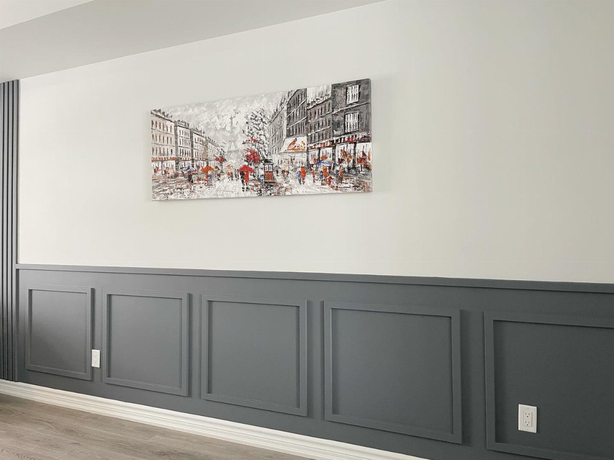
The example shows the classic split: dark panel below, light wall above, art centered in the open space. Without that color break, the eye travels straight up and the ceiling feels higher.
Best in dining rooms, entries, hallways, and powder rooms. It ages forward, not backward.
8. Vertical Wood Slats
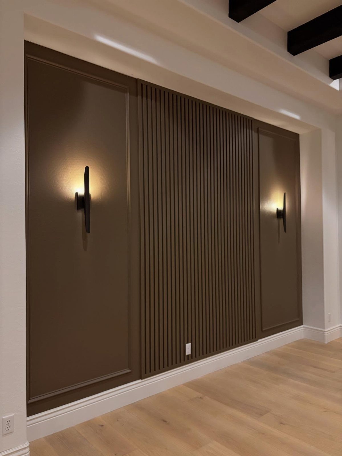
Vertical wood slats bring warmth without the heaviness of solid paneling.
Wood tone does the heavy lifting here; a warm oak reads traditional, while something bleached or ebonized shifts it contemporary. Ceilings on the taller side get the most from this, since the vertical lines pull the eye up with them.
Behind a sofa or dining table, the rhythm of the wood does the decorating for you.
Keep nearby decor simple. The slats are the statement.
9. Horizontal Wood Slat Wall
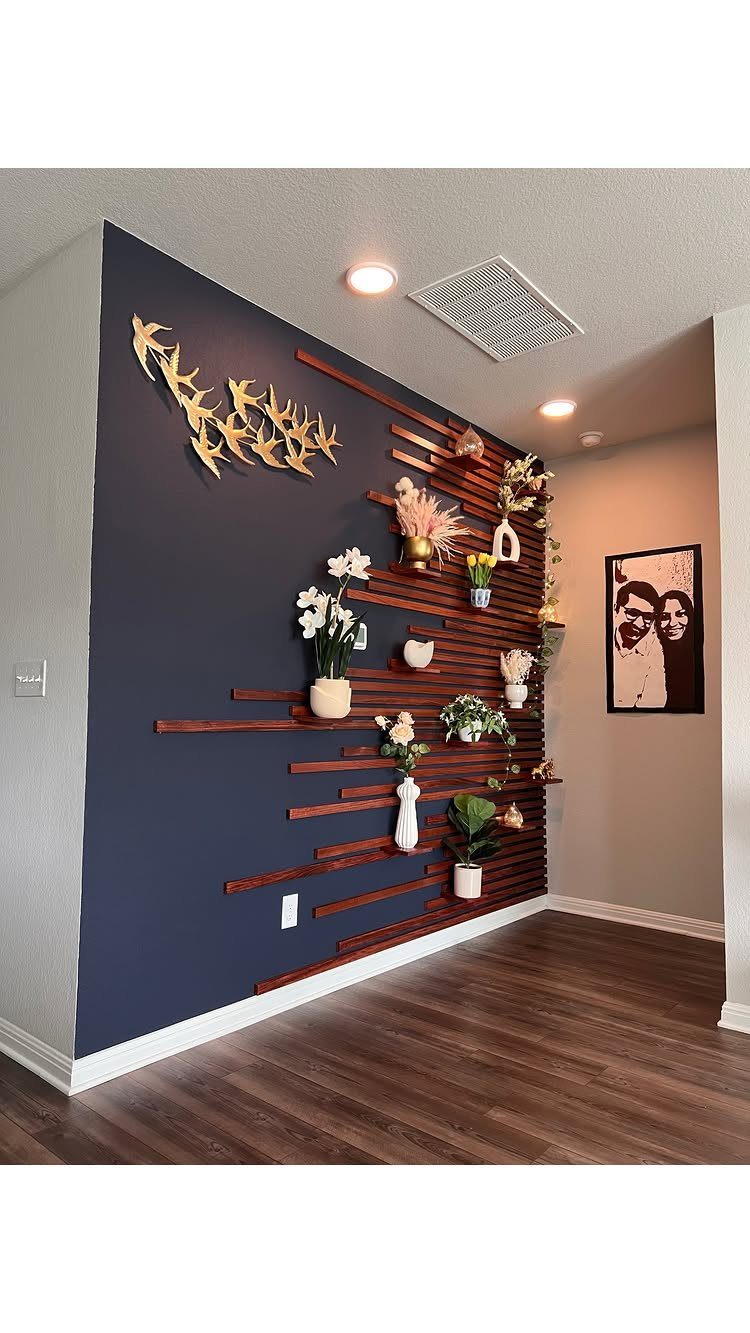
Navy blue behind natural wood is a specific pairing that grounds the wall without going full dark.
The slats themselves become shelving here: small pots, a vase, a piece of brass wall decor sit right on the strips. That turns the accent wall into functional storage, which matters in a small living room where every surface counts.
I’d keep the objects minimal and repeat the wood tone in one other piece nearby, a side table or frame, so the wall doesn’t float alone.
10. Geometric Wood Molding Accent Wall
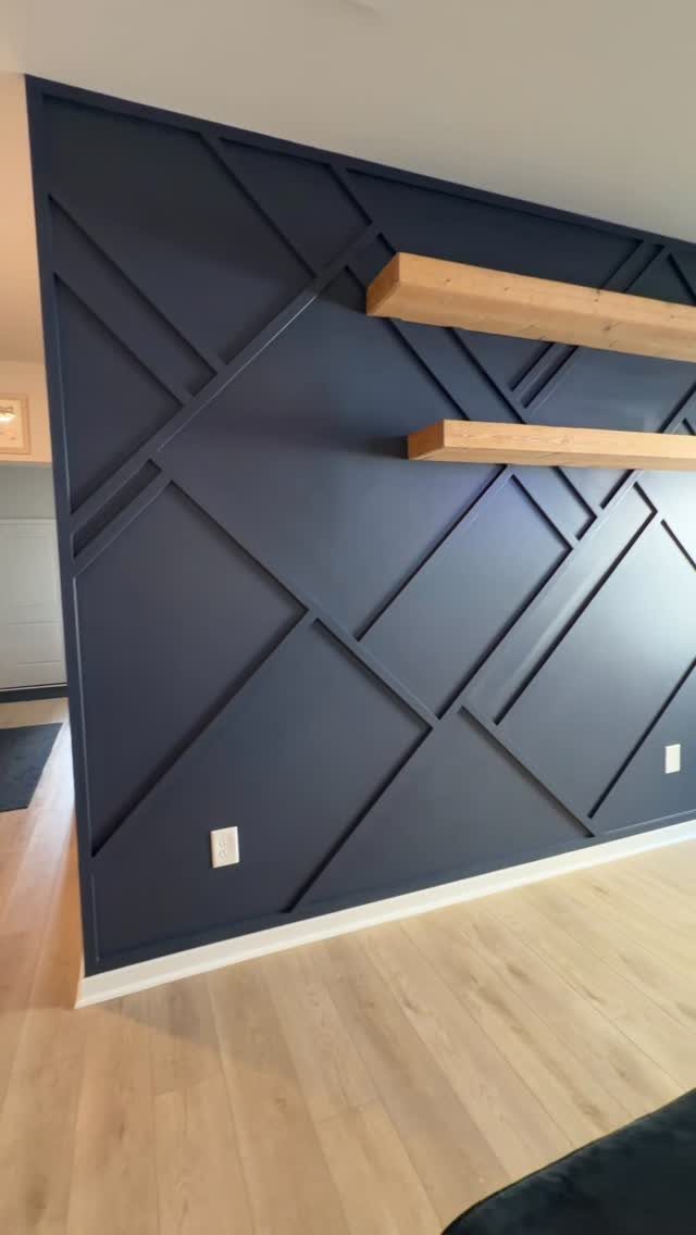
Intersecting wood trim on a dark ground gives you geometry without the permanence of tile or the dust-collecting depth of full 3D panels.
Raised strips read as molding rather than slats, which changes the install: you’re cutting and attaching individual pieces to a flat backer, not running continuous boards.
Two thick floating shelves cross the pattern, which is a smart move. The shelves break the geometry before it becomes dizzying, and they give you a place for actual life: a drink, a book, a plant.
Paint the base wall first, dark and flat. Attach the trim pieces with construction adhesive and a nail gun, then touch up any scuffs.
The whole job is a weekend if you pre-cut at the store.
11. Backlit Geometric Wall
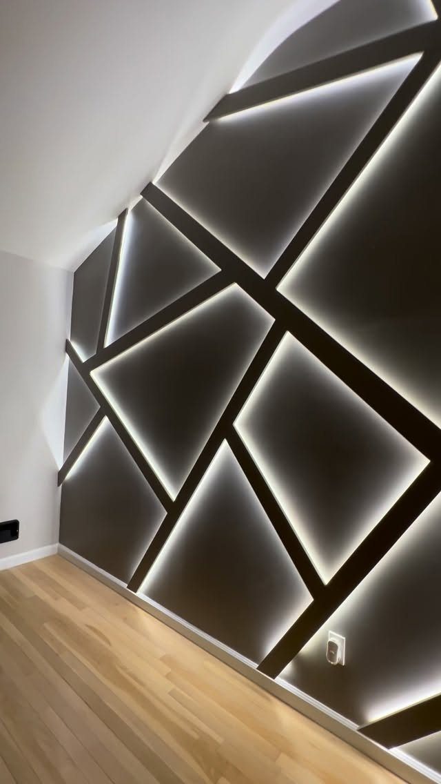
LED strips tucked behind raised trim turn a geometric wall into something that reads as built-in architecture after dark. Bright white light keeps the look modern and precise; warmer temperatures would feel cozier but softer-edged.
The install is two layers: the flat backer wall, then the raised geometric pieces mounted slightly off the surface so light escapes from behind. Aluminum channel strips behind the trim keep the LEDs straight and dissipate heat.
A dimmer switch pays for itself in usefulness, since full brightness is rarely what you want for more than a few minutes.
This is the most technical idea on the list. If you haven’t wired a light switch, hire that part out.
12. 3D Textured Wall Panels
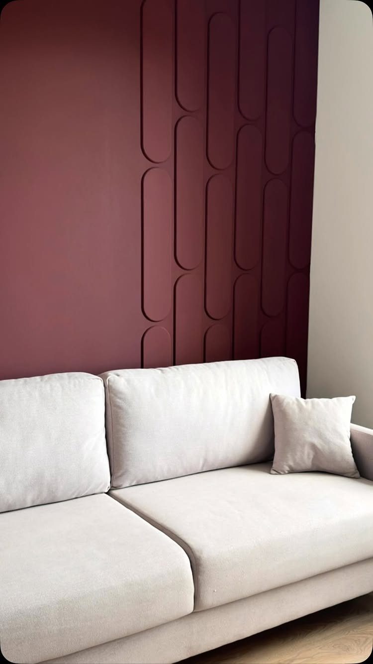
Raised 3D panels add actual depth, not the illusion of it.
Deep burgundy is a bold choice that works because the rest of the room stays neutral: light sofa, light floor, no competing colors. I’d follow that ratio.
One saturated wall, everything else quiet.
Panels like these mount with construction adhesive and a few screws, then get painted in place. The seams between panels need caulk and careful touch-up, so factor in drying time.
Materials for a full wall stay reasonable, and most of a Saturday goes to the install.
13. Patterned Wallpaper Accent Wall

Wallpaper works best when you commit to a pattern that already lives in your room. The floral above the wainscoting here is soft enough to read as texture from across the room, bold enough to reward a closer look.
For renters, removable wallpaper has come far enough to survive a lease. For owners, standard paste-the-wall paper costs less per square foot than most paint jobs and covers faster.
Match the repeat to your wall width so you are not throwing away half a roll at every seam.
I’d skip small-scale geometrics in open-plan spaces; your eye tires of them before you’ve crossed the room. Florals or large-scale abstracts hold up better from a sofa distance.
14. Shiplap Accent Wall
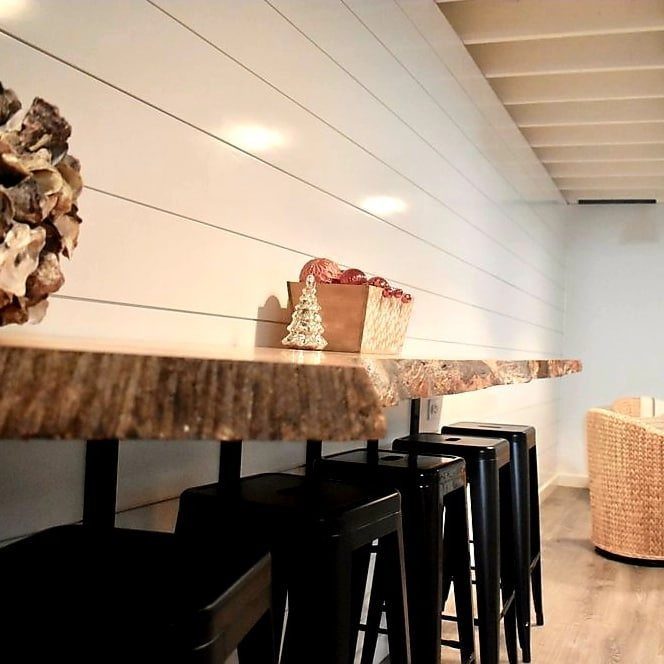
Shiplap reads as casual because the gaps between boards catch shadow and break up the surface. Horizontal runs widen a room; vertical runs stretch ceiling height if that is what you are short on.
White shiplap stays the safe default, though I have seen black shiplap behind a bar like this one look sharp against warm wood and brass. The boards are just 1×6 or 1×8 pine, face-nailed, with a nickel gap.
Paint-grade shiplap costs less than stain-grade; the difference is enough to matter on a whole wall.
One warning: shiplap telegraphs every imperfection in the wall behind it. Take the hour to find your studs and shim flat, or the shadow lines will wobble.
15. Flat Wood Paneling
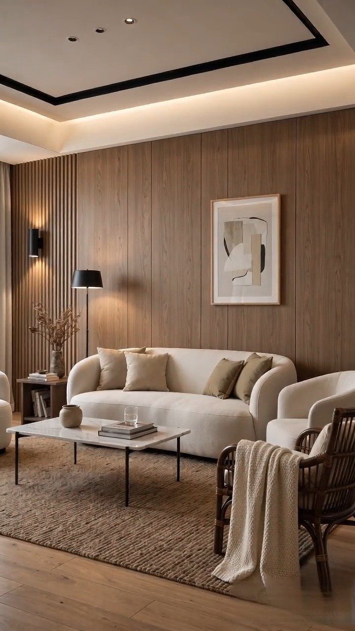
Large-format flat panels read modern because the grain runs uninterrupted and the seams sit tight. The wall behind that sofa uses boards wide enough to feel almost like furniture, not siding.
Grid paneling in a deep stain is the historic cousin, per the notes; it suits jewel tones and brass. Rift-sawn white oak or ash keeps the grain quiet for a cleaner look.
Material costs add up fast for flat paneling; hiring out installation adds more.
Chevron or herringbone patterns take extra material and a patient installer. I would attempt herringbone only on a wall with no windows or outlets to break the rhythm.
16. Picture Frame Molding Accent Wall
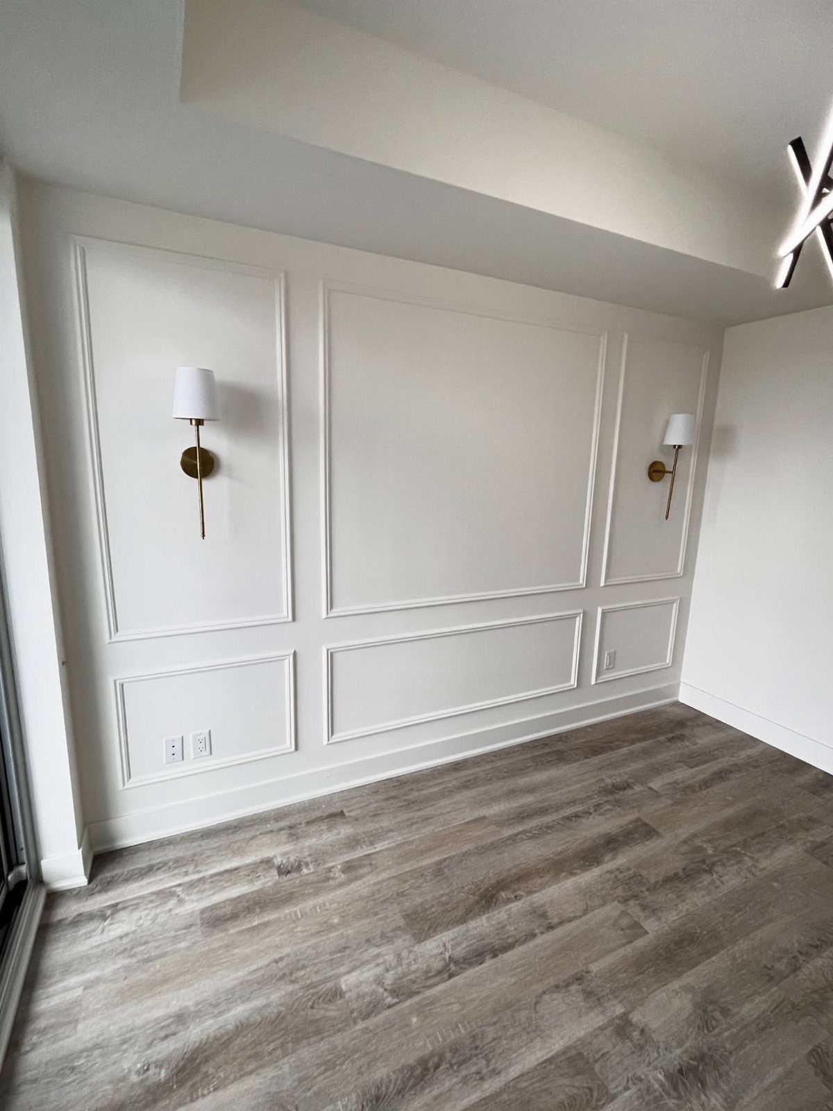
Picture frame molding is the cheapest architecture you can buy. The boxes are just 1×3 poplar, mitered at the corners and nailed to the wall; paint everything one color and the shadows do the rest.
Standard placement puts the bottom rail at chair-rail height, the top rail at picture height or just below crown molding. Boxes look best at a tall rectangle ratio, spaced close enough to read as a rhythm.
A whole wall runs light on material cost; the labor is where you spend your Saturday.
I would keep it white in a room this size and let the sconces supply the warmth. Color on molding works better in a powder room or entry where you are not staring at it for hours.
17. Decorative Arched Panels
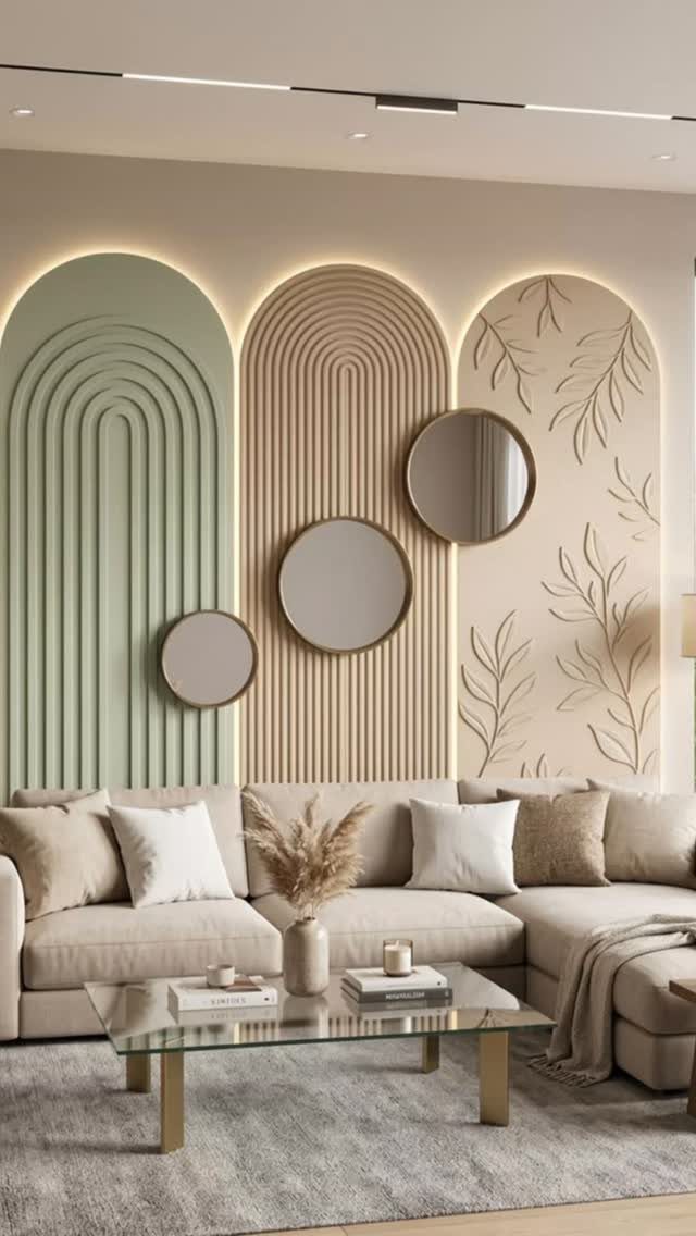
Arched panels are the most custom look on this list, and the most expensive to buy prefabricated.
If you are building toward this yourself, start with flat MDF arches cut on a router or ordered from a cabinet shop.
Fluting requires a roundover bit and a straightedge guide, or you buy fluted sheet stock by the 4×8 sheet now. Backlighting means planning wiring before the panels go up; retrofitting is possible but ugly.
A DIY version at this scale still runs several hundred in material; custom fabricated panels installed run into the thousands. The look suits rooms that already have some curve in their furniture; straight-lined modern spaces fight it.
18. Metallic Line Geometric Wall
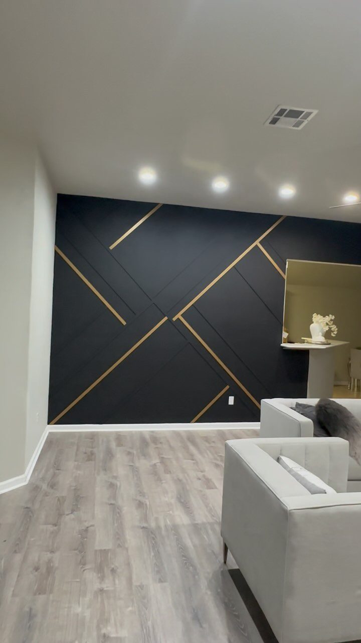
Gold lines on charcoal read as luxury because the contrast is absolute and the scale is human; your eye traces each intersection without effort.
Painter’s tape and metallic paint will chip and look it within a year. Real metal trim, either adhesive-backed channel or nail-on screen molding, costs more upfront and survives cleaning.
The notes suggest masking triangles in 2–3 shades; for this specific look, I would stick to one dark ground and one metal.
Geometric walls punish uneven spacing. Measure twice, snap chalk lines, and accept that the first piece sets every piece after it.
A full wall takes a full weekend if you are fussy about the joints; I would be.
19. Camouflage Painted Wall
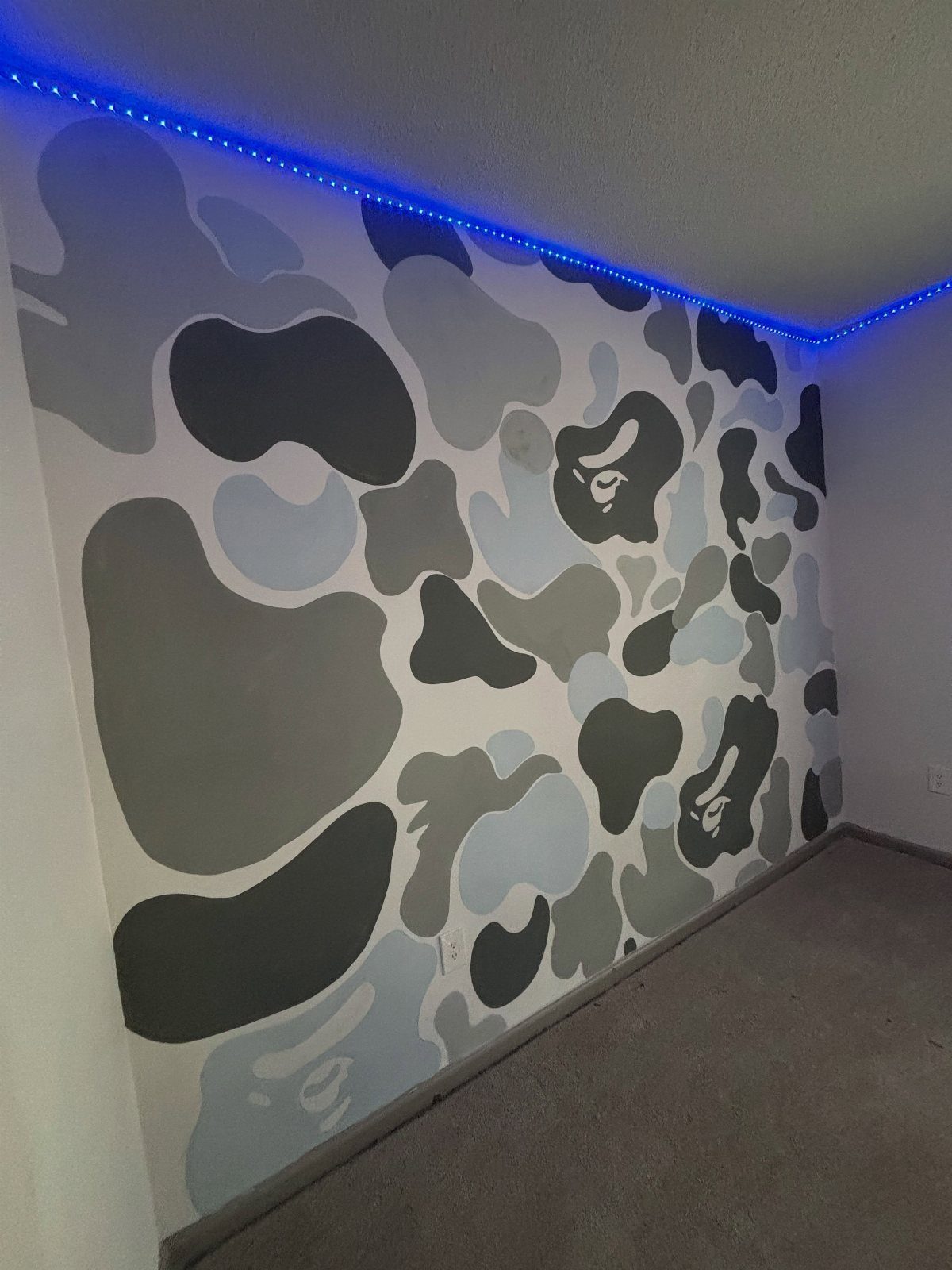
A camouflage paint job reads as graphic art instead of pattern because the shapes run huge, 2 feet or more across, and stay limited to 2 or 3 colors.
I have seen this done with charcoal, warm gray and off-white in a room that already had some edge to it, and the effect worked because nothing else fought for attention.
The LED strip at the ceiling is what makes it liveable; without that wash of light, the wall can feel like it is closing in.
I would wire the strip to a dimmer, not a switch, so you can flatten it to a night light when you want the room to rest.
This one suits a finished basement, a game room, or any space where you already own the moody furniture and do not need the wall to behave.
In a standard living room with normal light and normal sofas, the pattern overwhelms. Paint it flat, not glossy; any sheen turns the shapes into glare.
20. Gallery Wall
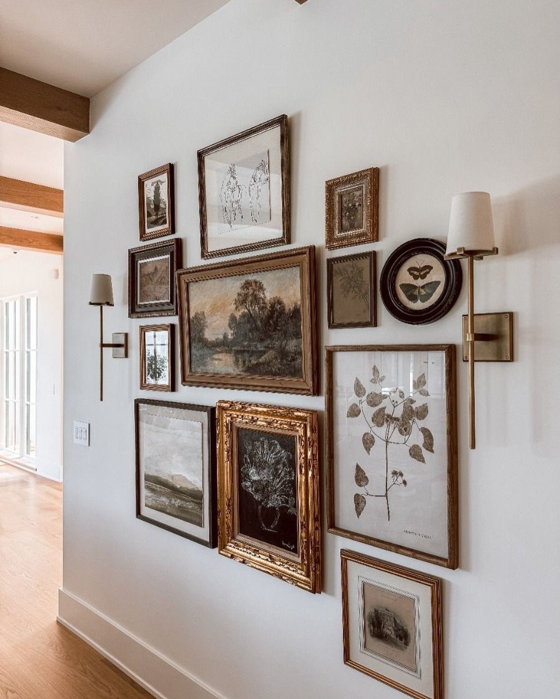
A gallery wall succeeds or fails on spacing, not on the individual pieces.
I have hung them tight, frames nearly touching, and I have hung them loose, with breathing room between; the tight version reads as one object and forgives mixed frames, while the loose version needs more discipline in color or style to hold together.
Mixed frames only hold together when the art inside shares something, a palette of soft greens, warm wood tones, or black line work.
I would sort your collection on the floor first, not the wall, and live with the arrangement for a day before driving any nails. A paper template of each frame, cut from grocery bags, saves patched drywall later.
For this reader, a gallery wall is the cheapest accent option on the list if you already own the art. The cost is hardware and time, a small outlay and a Saturday.
The trade is dusting and the occasional urge to rearrange, which is either a pleasure or a chore depending on who you are.
21. Built-in Shelving
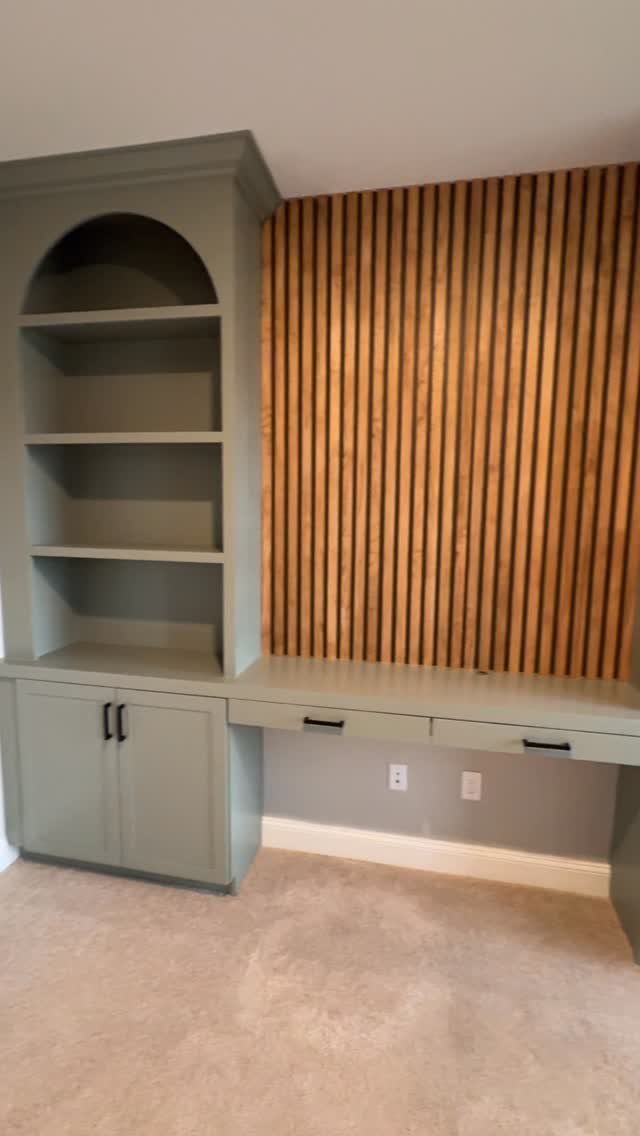
Built-ins turn a wall into storage that looks like it grew there, and color on cabinetry can stand in for an accent wall without committing an entire plane.
I would paint the backs of the shelves a shade deeper than the faces, not a different color entirely; the contrast reads as shadow and depth rather than decoration.
Vertical slats on a neighboring wall give the built-in something to talk to. Without that texture nearby, the unit can feel stranded.
If your room lacks that second element, add it or keep the built-in paint quieter.
This idea trades floor space for wall presence. In a narrow room, the projection of shelves and cabinets eats into seating or traffic paths.
I would mock up the depth with cardboard boxes for a week before ordering anything permanent.
You get a place for everything that looks like it belongs; the cost is committing to one wall, one arrangement, and one color for years.
Choosing the Right Wall
The wall behind your main sofa or fireplace is usually the right choice because your eye goes there anyway. Walk through the doorway you use most and notice where you look first; that landing spot is your candidate.
A short return wall or one cut by multiple doors reads as an afterthought, even with bold treatment.
Symmetry helps. A centered wall holds a color field or texture better than one broken by offsets or angles.
Check the light at different hours too. Soft, indirect daylight shows off paint and stone; a wall that sits in shadow most of the day can handle a darker, richer tone without going flat.
If the wall you want has built-ins or wainscoting already, work with it rather than around it.
Color Considerations
Two approaches work, and the rest is noise. A charcoal wall against pale surroundings has enough contrast to hold its own without you forcing the rest of the room to compete.
Layering navy over a softer blue keeps the tension low; the wall still reads as an accent but the room stays quiet.
Warm colors pull a room inward and make it feel smaller, which works when you want that; cool colors do the opposite and settle the space down.
Pick based on what the room already does too much or too little of.
Finish changes the outcome as much as color. Matte hides wall flaws and stays modern.
Satin survives contact and catches light softly. Limewash gives movement that flat paint cannot.
A gloss stencil laid over matte paint catches lamplight in shifts you notice only when you move through the room.
Test samples at wall scale, not swatch size, and live with them through a day of shifting light. A color that holds at 9 a.m. and 7 p.m. is the one.
Beyond paint, wood slats, thin stone veneer, or fabric panels bring their own color through texture rather than pigment.
DIY Tips
Paint is where you start if you have not done this before. It forgives, it covers fast, and a single gallon runs less than most other materials.
Painter’s tape and patience give cleaner lines than freehand bravado.
Wood panels, faux concrete, and peel-and-stick wallpaper come next in ambition, not first. Measure twice for anything with seams; a ¼ inch error at one end becomes 1 inch by the other and looks amateur.
Clean and prime before any application. Skipped prep shows through every layer after it.
For textured installs, batten, shiplap, or stick wood, layout on the floor first. Spacing that looks right in your head may read wrong at full scale.
A dry fit costs an hour and saves a wall of patched holes. The satisfaction of finishing yourself is real, but so is the cost of rushing.
Lighting Effects
Natural light shifts color through the day, so a sample that reads sage at noon may turn gray by evening. Paint a 2-foot square and observe it morning, afternoon, and under your lamps at night before you commit.
Artificial light has its own bias. Incandescent and warm LED pull yellow; cool LED and daylight bulbs push blue.
A wall meant to glow in lamplight needs testing in lamplight, not just window light. The same finish can feel cozy or clinical depending on the bulb.
For backlit walls or LED accents, a dimmer switch matters more than the strip itself. Full brightness is useful for about 10 minutes; the rest of the time you want adjustment.
Wire the dimmer during install, not after. Retrofitting means opening finished work.
Frequently Asked Questions
Which wall should be an accent wall in a living room?
The wall behind your main sofa or the one framing the fireplace tends to draw the eye first, and that is the one to work with.
Soft, indirect light shows off color and texture best, while shadowed walls suit deeper, richer tones.
What is the rule for accent walls?
An accent wall should contrast with the other walls enough to create a clear focal point, but it should not fight anything else in the room.
Work with the existing architecture and furniture layout so the eye has one place to settle. There are no absolute rules, only the discipline of choosing one center of attention and letting everything else support it.
Are accent walls outdated in 2026?
No. Accent walls still work when the material and color match the room’s actual style rather than following a trend cycle. A subtle textured wall adds warmth without overwhelming the space, and a bold, well-chosen wall still anchors a room.
The ideas that age poorly are the ones that ignore the existing architecture and furniture.